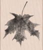
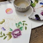
Hello Friends, How are you on this fall day? I have been trying to spend a little time during the day with my watercolor set and I tell ya’ it’s super relaxing and fun. Before I knew it I had several of these leaves painted with two different color palettes. ( The leaf stamp is called “Maple Leaf” from Hero Arts. )
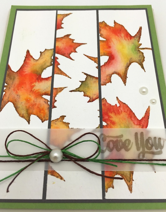
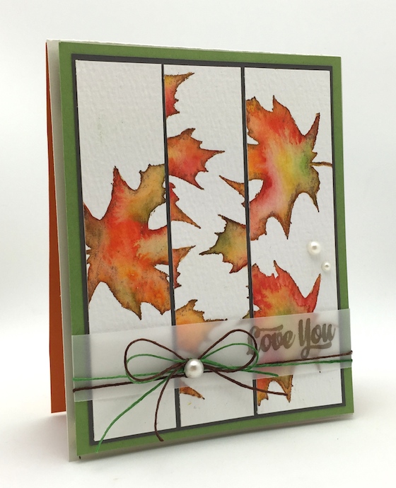
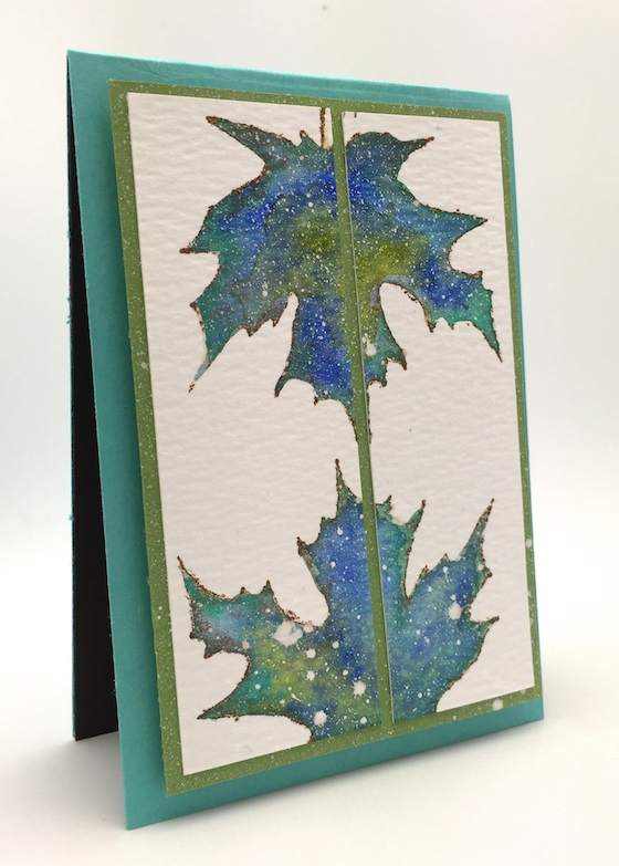
Since I had so many leaves painted I thought it would be cool to try and achieve an more artistic look with some of the leaves…. a geometric look of sorts. A strip of vellum with a Simon sentiment was all that I had to add after mounting the leaves on some colored cardstock.
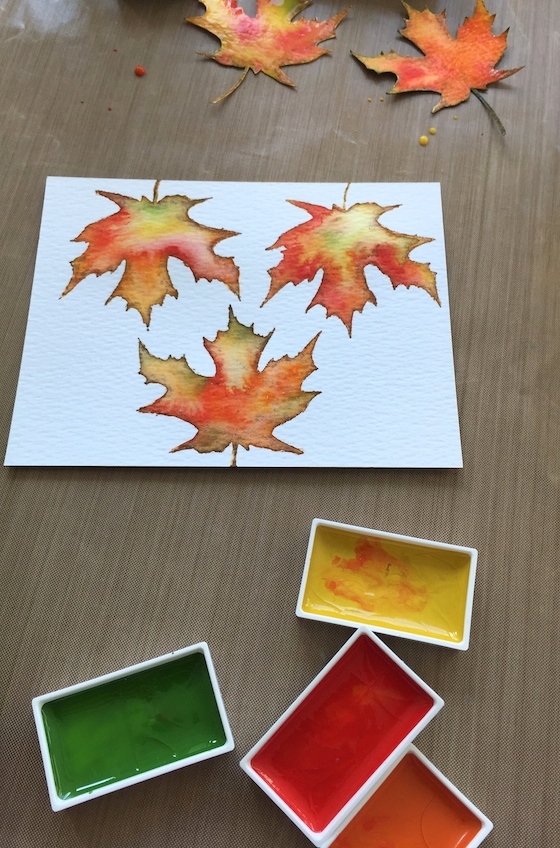
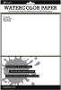
The orange, green, red and yellow palette was fun to mix together. First I stamped the leaves on this watercolor paper (I like it cause it’s really white and bright) with Gathered Twigs distress ink. I was somewhat careful to ink up only the edges of the stamp with the corner of the distress ink. Did you see the video from my last post with the poinsettia? The technique is the same as I did for these leaves.
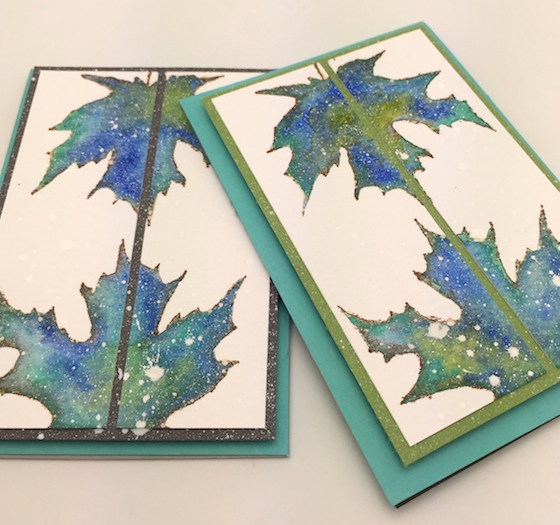
I think most of you know that I like to use color in different ways and was itching to try these fall leaves with a two blues and green color palette. I always need mini cards without a sentiment so all I had to do was cut these leaves down the middle and layer up with some of Simon Says Stamps beautiful card stock.
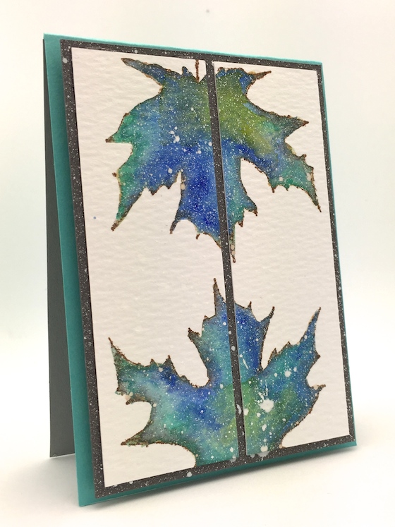
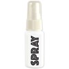
What I think really made these leaves pop was the white spray ink from Hero Arts…. L.O.V.E.
Here is a post with a card and a video using this white spray ink again.
TELL ME YOUR FAVORITE COLOR PALETTE that I used today. The blue or the orange one. I WILL SEND A GOODIE BAG TO A RANDOM WINNER NEXT WEEK.
I do have to more cards with leaves to share next time. Totally different. Have a great weekend and happy crafting. Hugs, Kathy
CARD SUPPLIES & LINKS:


 Sew Fun & Winner
 Watercoloring with Tombow & Video
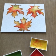 sneak peek and winners
You’ll think I’m awfully calssic but I prefer the orange palette. Love the idea of cutting strips and mixing them!
I Love the blue/green one but the orange just pips it at the post… mostly because, when you think of Autumn, you think of warm scarves and hot chocolate and sitting by a warm fire… so the warmth of the orange palette fits just perfectly! The blue/green one would be perfect for a guy though!
I love blue and green together; but for the leaves I prefer the traditional autumn colors. Your watercoloring is SO nice; love the designs you used, Kathy!
I like the orange palette…looks so real – beautiful!!
Love the orange color palette. Thanks for the chance to win.
Beautiful cards, LOVE the watercoloring!!! Although I am normally drawn to blue in this case, I LOVE the orange!
These look amazing! I love them both, but probably prefer the orange just slightly.
I love ’em both! I love the orange because it has such a natural feel to it and the blue because of your outside of the box thinking. Both cards are stunning!
I love the orange, thats my favorit but the blue one is also beautiful.
ORANGE!
although I like the blue too!
They are both beautiful, but I love the orange palette.
Definitely orange! My brain is obviously trained to be a traditionalist! I would love to see a solid Christmas tree or snowflakes done in the blues/greens! Beautiful !
I love them both, but the blue and green leaves catch my eye more. I think because the white spray actually makes them look like they are sparkling 🙂 Lovely as always! <3
Wow this is a tough one! For me I love Fall colors and yet where I am mostly green and Blue Florida is why I left Illinois and miss the Fall colors so I have to go with the orange yellow red aside from red is my favorite color!
The traditional autumn colors all the way….. reminds me of our beautiful New England autumns. I love your technique though. Thanks for sharing.
Great technique with the strips! Love the orange – looks like my own maple tree this fall. 😉
All your cards are just so beautiful ..I love the orange leaves combo ..The white ink spattering really does make these leaves pop ..Thanks for sharing 🙂
I love the blues but the orange leaves just melt my butter. Cutting the strips and flipping the middle panel is brilliant. I have a colored panel of leaves that I just wasn’t sure what to do with and this will work beautifully. Thanks for the inspiration Kathy!
The orange really speaks fall. The blue is pretty (it’s my favorite color) but it’s not really fall. Both are beautiful. Love the way they are dissected.
thanks for sharing two great projects.
I love them both but I suppose I would choose the blue one as it is so different!
I love the blue the best, but the orange is so pretty for this time of year.
I love the blue! So utterly gorgeous!
Beautiful cards I luv both color palettes but the blue just pops out as so unique to me
Though I really like the blue and green leaves, I think I prefer the more traditional orange one. I really love them and the cards you made with them.
Oh the Blue!
I’m usually a blue girl but fall colors always get me!
Gorgeous cards!! I love love love the blue/green, and you’re right about the white spray! The perfect finishing touch. 🙂
I love the red/orange one – probably because I love fall but since I live in Southern California I never get to experience it! lol
love all your work – but I prefer the orange leaves today!
Sandra ltb
I like the blues and greens, it’s such a pretty alternative to the standard fall colours.
these are just gorgeous! i go with the traditional oranges etc… but I don’t have a creative imagination like you!!!!! i love seeing what you come up with–you are a true artist!
Love the blue colors! So pretty. Love the unique layouts, so effective! Wonderful to see. Thanks so much!~kim
Kathy this is such an awesome technique, love the finished projects. Being that it’s fall and I dearly love the fall colors, it’s got to be the orange combination. Thanks for sharing your creativity with us.
Hugs
my fave color pallet is always green and blue but those orange leaves are so realistic!
I love the orange one!
The traditional orange leaves are my favorite as they are so realistic looking. I wanted to pin this tut but could not find it on one of your boards – which board is it on? Thanks!
Both cards are so gorgeous, but I’m a traditional gal, so I’d have to go with the true fall colors. Thanks for sharing.
I love both….The orange and red is like the tree outside of my house. However, I love the white spray over the blue and green. Such pretty work!
I really enjoy your blog! I like both but the orange is my favorite! I’m very traditional!
I like both the pallets but the Orange was my favorite. I like the white splatters. Thanks for the chance to win
So gorgeous!!! Right now I love white pink and gold!
What a great idea! Love the white sprinkles. If I have to pick, the orange would be it.
While the blues and green are GORGEOUS, I still like the more traditional color palette. Just a warmer feel I think. But all are wonderful!
Just beautiful! Am loving the traditional colors. Thanks for the inspiration.
Love the orange colours . Very realistic. Our leaves just finished falling off the tree out front and that was exactly the colour they turned. Beautiful job painting them.
They’re both gorgeous. I would go with the orange, it just so realistic – guess that’s the traditional side of me taking over. Love your blog, I learn so much. You are so very talented.
Finally….! I could not wait to see what you did with those leaves and I’m not disappointed, that’s for sure. The only thing that would have made it better for me would have been to see you actually paint them. They are gorgeous – both color schemes.
My favorite is the orange, yellow, & green palette. Reminds me of all the beautiful fall colors this time of year.
They’re both so pretty but I’m traditional. Love the orange-beautiful fall colors-my favorite season!!
The cards turned out really pretty. I love the color of the first set of leaves. You nailed it. Thanks for sharing.
HAS TO BE ORANGE! I like how you used different panels and those leaves look so realistic. Great products produce great results but you have to have talented designers to execute amazing results. I do like the blue card so congrats on two lovely cards.
LOVE both color palettes but the blues/green is my favorite!! I use those colors the most when I am creating and you did a wonderful job making the leaves look gorgeous using these colors! TFS!
I love both, but if I have to choose, I would say that my favorite is the orange one!
These are LOVELY cards. I’m more partial to the orange color palette but that’s because I love the beautiful foliage during the autumn. Love how you split the leaves up. Gorgeous!
Fall is my favorite time of year so traditional orange/red is my favorite. How did you decide on brand you use? Which color count set do you use? Your cards, poinsettias too, a beautiful and have inspired me to try.
I love the orange color palette, especially for the leaves. Beautiful cards!
Kathy – The orange colors are so realistic, I have to go with orange. Thanks for the inspiration you provide!
Normally I tend to go with earth tones but the leaves in blues & green were so unexpected & beautiful I have to say that those are my favorite. Thanks for the inspiration!
Oh my goodness…. I love them both!!! But I gues I am leaning more towards the orange.
Both color palettes are beautiful, but I’m partial to the red, yellow, orange, green leaves. Either way, the cards are beautiful!
Love both combos but the look of the blues and greens is awesome and I like that it’s not what you expect on an autumn card. Love it!
Your cards are truly fun. I love the FALL in Colorado where I live in the Mts. So the Orange palette is what would fit. …….but how fun is your Blue/Green. Good JOB!! Creativeness at its BEST!! Happy Thanksgiving……..
I’m really torn on this one, as the blue/green combo is usually my favorite, but I guess I’m a “natural” kinda girl ’cause I prefer the orange leaves–maybe because they look like the real deal? Both are so pretty, but yeah, orange is my preference.
The orange is very stunning and probably more realistic, but I have to say that I am partial to the blue.
The orange is definitely more traditional but I love the blue palette! Beautiful.
I like the traditional orange.
I love the red orange one! It reminds me so much of fall!
I love the orange one, because Fall its my favorite season. Those colors make me happy! The blue one is gorgeous too! Thanks for sharing, look foward to practice this technique! Thanks, Kathy!
Both are stunning, but the unexpected blue is my favorite! Thanks for the inspiration, Kathy!
The blue is unique but I like the traditional orange.
I know the orange is the more traditional one, but I really like the blue one
I like the orange group.
I’m afraid I’m a traditionalist so, naturally, my fave is the yellow, orange & green palette. The card is simply perfect
Love everything you do! You have such amazing ideas Kathy. I really love the Orange palette card and would definitely be my favorite.
wow, they’re both great! I love the orange more though 🙂
love the orange one! i’m in the autumn mood…and loving some orange these days! 🙂
Thinking fall I’d go with the orange set, but the blue set has a wonderful winter feel to it.
Both are gorgeous but I like the non-traditional blue palette. Love the white spray mist too.
I just love you’re watercoloring. So lovely. I’d have to say my favourite color pallet would be the orange. Just love how you cut them and mixed them up. What a great idea.
Have a wonderful relaxing weekend.
Thanks for the chance to win! I LOVE oranges and yellows and reds…so I’m gonna go with that palette for today…. 🙂
I love both colour palettes you used but the blue/green is so striking because it is unexpected.
I love the Orange color palette, those leaves are beautiful.
Love the orange leaves the best. The blue ones are nice too, but I love the orange!
Wow I love how these turned out! Beautiful!! My favorite is the blue!
I love your cards. They are so real looking. Great work. Love the orange card the best, but would love it in most colors, even in shades of green.
The blue/green leaves were pretty, but I guess I’m a traditionalist, so the orange pallet is my favorite. Great idea to put the leaves on panels. I made a card with water colored leaves yesterday, Thanks for the giveaway.
Hi Kathy, Both of your split leaf cards are fabulous. I am a true blue person, just love blues, so the blue card is my favorite. The orange card is lovely, perfect for Autumn 🙂
My fave is definitely the orange! I love your cards and you inspire me to craft more Kathy,thank you!
I love the orange colors the best. I love Autumn colors so I’m a little biased. 🙂
Call me a traditionalist, but I prefer the orange. The gold/orange maple is my favorite autumn tree. They are not common where I live now and I miss them.
I think I like the more traditional colors, but the blue/greenish are so classy looking!
Both are gorgeous, but as much as I am a traditionalist, my favorite color has always been blue. That blue/green color palette is beautiful for these abstact leaves. TFS hugs, Kristina
Wow, I never would have thought to try the leaves in a blue and green palette but they look amazing! Love the white spray detail!
I am so interested in trying the water color technique. I love the orange color palette, so pretty!
Absolutely beautiful and oh so creative. Although the Fall colored leaves are really gorgeous I love the icy, wintery look of the blue and green ones!
Kathy, both of these cards are gorgeous! I can barely wait to get in my craft room & try this technique. I love the orange leaves but I would pick the blues as my favorite just because it’s so unexpected.
Both are beautiful but the blue green is my favorite.
I love the card with the orange leaves. Beauatiful job coloring.
I like the orange palette, it is looks very beautiful!!
I am a “traditionalist!” So, I prefer the Orange leaves the best! The blue ones make me think Christmas! 🙂 Which isn’t too far away…..They’re BOTH BEAUTIFUL!!!!!!!!!!!! 🙂 I am LOVING those watercolors you use & may have to think about “investing” in them! 🙂
BLESSINGS!!!!!!!!!! 😀
Blue is my favourite colour but in this instance I am going to have to go with the classic orange. Love the way you made these cards. May have to give that technique a try. Hugz
Oh, I LOVE your leaves! And they made lovely cards, I think the warmer tones are my favorite only because those colors make them so realistic.
I guess I’m a traditionalist. I like the Orange much better. Blue leaves seems too out of the box for me!
I really love the blue colors!
You had me at Sneak Peek, I love the oranges. That is the perfect stamp too.
i LIKE BOTH, BUT MY FAVORITES FOR fALL IS THE RED AND ORANGE!
Since fall is my favorite season, the orange colors of course.
I really love the blue/green combo. Unexpected and beautiful!
Love the orange palette – the leaves realy pop. I love the way you staggered the panels which looks great. the white spray ink just adds extra dimension to make these cards look that extra special.
Fantastic cards Kathy! I especially liked the orange combo!
The blue and green colors look great together but on leaves it’s the orange all the way.
I prefer the orange one (boring but Canadian!). You achieved such a life-like result with the water-colours I thought you had stamped using real leaves! Beautiful cards, too.
These are so pretty and I
really liked the blue set!
Carla from Utah
I like the blue/green colors together (blue is my fav color), but I am drawn to the orange color combo for leaves because I think that looks naturally like autumn foliage. I enjoy your projects-thanks for the tips:)
Both cards are lovely. . . Fall is my favorite season so I am leaning toward the orange; however, blue is my favorite color and I tend to grab blues/greens for any project so the blue is perfect for leaves.
Both are beautiful but my favorite is the blue one, maybe it’s because is my favorite color or maybe it’s because it’s unexpected? Anyway, I love it! TFS
I love the traditional fall colors! It really reminds me of fall!
Ok so I do luv green and blue together. Green is my favorite color. But…… I am absolutely luving the orange, red, yellow and green together! I’m not a huge fan of fall EXCEPT for all the beautiful warm colors. And you so brought them out in your card! Simple but very eye catching!
Thanks for sharing another beautiful set of cards!
JoJo
I’m traditional, love to orange, red, yellow autumn color combo. Love your watercolor technique, all the leaves are beautiful and I love your artistic use of them on the cards.
These color combos are absolutely glorious! I especially love the orange one! Beautiful leaf stamp!
Hard one to choose. I love blue so I’m immediately drawn to that but the orange colours look more natural, so will go Team Orange!!
I love the orange palette…they’re such warm, beautiful colors!
I’m a leaf traditionalist! Love the orange ones best!
Both are stunning! Simply beautiful! Great technique. Love both color ways but I’ll go with the more realistic orange pallet. You are SO talented! Thanks for the great giveaway!
I love them both, but prefer the orange. Thanks for sharing!
BOTH cards are BEAUTIFUL Nichol – LOVE the watercolour technique and design!!! Normally I would go for the orange but today, with the white splatters, BLUE gets my vote, it has such a pretty wintery, almost magic aura – LOVE IT!!!
My vote goes to blue as blue is my favorite! Nevertheless, both cards are just fabulous!
I love traditional fall colors, but the blue and green leaves are so out of the box that I just adore them. Wonderful!
Beautiful cards. The orange one is my favorite, though. Autumn is my favorite season. I think of the trees as changing into their best colors before letting go of the their leaves to prepare for change, renewal, and happiness of a different sort through winter, spring and summer, to start all over again. Cheers!
Oh my — !!! Love Love AND love!! The prettiest leaves I have ever seen–! Love that sparkle…I MUST try to do something like this! Thanks Kathy — Love you girl!!
Awesome leaf coloring!! Love the card designs! I prefer the traditional orange palette!
both are beautiful, but my favorite was the orange palette is so warm!
Love them both, but I love the traditional colors most. The spray of the white ink it awesome!
Beautiful cards….autumn colours always appeal to me so I love the orange one!
Call me ol’ fashion, but I love the orange fall palette, and it looks truly authentic.
Oh wow! Both are gorgeous!! Orange is one of my favorite colors. I really do love the cards
They are both beautiful…but I favor the orange one. I especially like how you artsied up the layout! It’s beautiful.
WOWOWOWWOWOW!! I LOVE them both!! =) I really enjoy the Blue because its different, but the Orange is my FAVORITE because its so natural!! =) THANKS for sharing and have a Fabulous Weekend!!
Oh, these are beautiful Kathy. Love the coloring on both, and I do love both palettes. Orange is more realistic, but blue is my favorite color… so it’s a toss up right now…
Both palettes are gorgeous and so are your cards Kathy…my choice would have to be the orange leaves as I love warm colours! Thanks for the chance to win 🙂
I like the unexpected twist of the blue/green leaves!
I really love all of your leaves. The love you card is beautiful! My favorite is the last card with the green at the center of the cut strips. Love that white spray. I will have to look for that. Great ideas. 🙂 Thanks for sharing.
Katie B.
Great idea to colour your leaves blue … and I love the spray effect (another goodie added to my crafty ‘need’ list!) Gorgeous colouring on your orange card, I think it would be my favourite 🙂
for me I have to say the blue/green leaves are just beautiful!
stamping sue
http://stampingsueinconnecticut.blogspot.com/
BLUE!!! I love non traditional colors, it’s a nice unexpected surprise and a break from what we see all the time. I think it’s so fun.
Hi Kathy!! We are enjoying this beautiful Fall weather too. You know, I LOVE color and blue is my favorite color, but I’m constantly drawn to the Oranges! I don’t know why, it’s the same with my clothing, I have far more oranges than blues. LOL I think I like the serenity of blue, but the warmth of oranges pulls me in every time. These leaves are Gorgeous!!
Both cards are beautiful but I love the colors of fall. It’s my favorite season for paper crafting.
They are both lovely, but I like the orange one the best.
I love the blue, it’s very soothing!
I absolutely love the oranges and the greens and just how the watercolor has melded together. Truly beautiful!
Beautiful card but i prefer the orange, green, red and yellow palette
I prefere the orange one but I like the white spray on the blue ones
I love orange, green, red and yellow! Such pretty colors 🙂
Although blue is my favorite color, I loved your orange palette. I love the little bits of green and brown in it because they cause the reds and oranges to stand out more.
The orange palette was most stunning! Thanks for sharing your techniques!
I love the blue leaves, sooooo very creative!!! BUT, I think the orangey red are my favorite. Maybe it really is the blue ones!!! This is too hard, I can’t decide!!!!
Definitely love the blue and green palette! And loved that you added the white spray mist on top!
I, definitely, favor the blue. It’s so outside the box!
Oh, the blues…SO beautiful and unexpected!
I like them both Kathy, but the traditional colored one would be my fave of the two!!
I like the blue
Love the blue palette.
So beautiful Kathy!
I really love the blues and green leaves on the black background!
So pretty! I will have to check out the video, thanks
I like the orange color palette the most, but both cards are beautiful!
I love the blues and greens! It’s fun and unexpected!
I like the red yellow one best
I too am traditional in that I love the fall colors of the vivid orange, yellows and red. Just beautiful!
Gimme the blues any time LOL. Besides, I much prefer spring and summer to autumn. That’s one of the reasons we moved to Crete.
Marianne x
Blue is more unexpectable I think
Both of these are beautiful and hard to decide on which one is more my favorite but if I had to choose one, it would be the orange one as it pops out more to me, but also love the blue.
Love the watercolor! I prefer the orangey leaves!
my faves are the brown, orange fall leaves they are so beautiful
I love the classic orange pallet. Just the classic fall colors look so pretty!
LOVE the more traditional orange autumn colors, but could clearly see myself fooling around with other colors, too. You did a lovely job on both!
Absolutely LOVE you water coloured leaves! Beautiful colours. TFS and for the chance to win.
I love the traditional leaf colours but them I’m a traditionalist when it comes to colours. I have those paints and have never got anything come out anywhere near as good as these leaves. Think I need to watch your tutorial again and find time to give it another go.
Hugs
Hazel xx
I know the oranges are traditional for fall, but I love the blue and green palette the most
Oh my I love them both but I think my favorite is the orange because they look so real!
well, i like them both but if i have to choose it would be the blue combo.
Can you get any more creatively talented! My INSPIRATION is busting at the seams just watching you create! Thanks ever so much…wow, a chance to win those stamps is overwhelming….thank you sooooo much!
The blue green cool color combination is very fun and unique… Like these stamps!
Don’t know why we have to choose a favorite when both were beautiful! Thanks for sharing!
I like the orange best. Thank you for sharing with us.
Love the background! Love the card!
Blue and green!
Both colors are magnificent. TFS and a chance to win.
Wow the blending is gorgeous.
Much to my surprise, I like the blue/green best! Just cuz it’s so unique, I think!
Oh. My. What gorgeous cards! I love how you made your leaves and the first card is great with the way the strips are offset so the leaves don’t line up. I think I have to say I love the orange colours the best. 🙂
love them both
I LOVE these cards. So beautiful, colorful and a great idea. I do love the orange colors, but the others are fun too.
i like the ornge and yellow too
Kathy, for shame! Making us pick:-( I LOVE both of the color combinations! I guess, if I have to pick just one lol, the orange, red and yellow one.
Hope you have an AWESOME day!
Orange/red palette. I’m too traditional I think.