Hello Friends, How are you today? If you are new to my blog a warm welcome to you. Today is a special day for me because the sweet, wonderful, kind and talented DT at Power Poppy is having a hop to celebrate the Coloring Challenge!! How exciting and heart warming. If you are wondering what The Daily Marker 30 Day Coloring Challenge is you can click here to read all about it. The most important thing to know is anyone can join at any time!
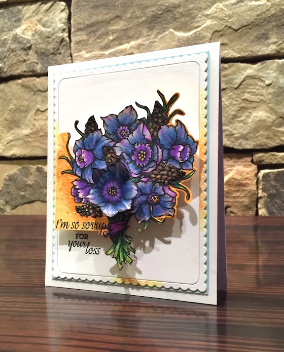
I inked up the this beautiful stamp set called “Daffodils” with some Memento Ink. It was a conscience decision to not color the daffodils an authentic color even though I love the whites and yellows. Check out all different cards and color combos with this stamp set in the Power Poppy store here.
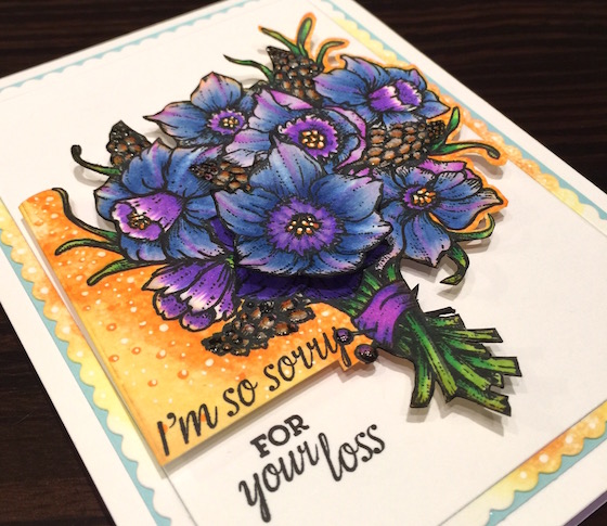
Can you believe that I had another snafu on the background but, it turned out eventually. I had cut the edge on the left so it’s a little crooked but, I’m ok with that.
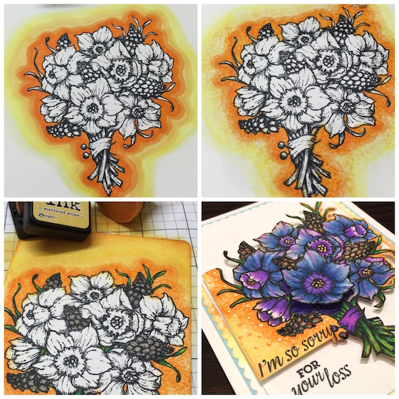
I never do an orange “halo” around the image but, I was willing to try and go out of my comfort zone. After using a few colors I added some Blending Solution with a rag then some distress ink. Did not like it but, was determined to make it happen so I ended up cutting the background out again. (I figured you would enjoy seeing another one of my mistakes in a good way lol.)
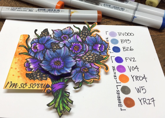
You might want to notice how I fussy cut it out leaving an orange boarder on the right and part of the background on the left. I added some glossy accents to the berries and white dots with a gel pen.

Hop on over to the Poppy Poppy Blog and be sure to have some fainting salts. These gals are TALENTED! Power Poppy has some fun challenges that you can combine the coloring challenge with and more chances to win some of these amazing stamps. A big Thanks to Allison Cope ,Christine Okken , Cindy Lawrence , Julie Koerber , Katie Sims , Leslie Miller , Stacy Morgan & Tosha Leyendekker for taking time from their busy schedules to play along.
GIVEAWAY!! All you need to do to quality is leave a comment and I will pick a random winner at the end of the challenge. Good luck and thanks so much for your visit I can’t tell you how much it means to me and thanks for inspiring me with all of your coloring. See you tomorrow! Hugs, Kathy
P.S. TO LINK UP & share your coloring click here and go to the bottom of the post.
P.S.S.If you wan to see what everyone is submitting for The Daily Marker 30 Day. Click here to see what is being shared on my blog but, you need to scroll to the bottom of the post. You can click here too to see everything under the hashtag #thedailymarker3day3 that’s on Instagram.
 DAY ONE-30 day coloring challenge-giveaway
 DAY 1. Turn a Starbucks Cup Into A Card
 a sweet treat for you


So pretty. I would never have thought to do it that way. Thanks for a great idea.
Your card is gorgeous and thank you for the introduction to such an amazing company- those stamps are swoon worthy!
Such a cool idea to do blue and purple daffodils! Love it!
Wow!! Very beautiful!! Love your coloring.. Love how you’ve trimmed the image. Very beautiful!! I love it when you show your mistakes and how you overcame it! Most of us face similar situations and it helps to have different ideas on how to overcome them!!
-Berina
Moxie Craftie
Awwww.. thanks so much. We can all learn from our mistaskes. Color your World. 🙂
Gorgeous card. I love these colors and thank you for inspiring us all 🙂
Omg! I love this projectt. It is beautiful. Leaving half of the background and fussy cutting around the rest is just genius . Thank you Kathy for doing another color challenge, it has motivated me the get coloring again.
What a beautiful card and I absolutely love the orange halo and how you kept part of it where you fussy cut. Also love how you cut part of the focal piece yet had the left side squared. Not sure I said that right. Very clever of you. I like how you arranged the stamped sentiment, too. Notes to self again.
So ironic you would have a sympathy card today….I have to get one in the mail today. I hate that my creative juices won’t flow when I have this type card to make. I’ve had to send way too many of these lately. I try to have a few made ahead, but my supply has been exhausted recently.
Got my Frisket yesterday….now to figure out how to use it. Have you read the warning label on this stuff? I forgot to order the hasmat suit I’ll need. LOL I’m not scared….LOL
Have a wonderful day….
Kathy! What a beautiful carf! Im always amazed with your work. Love the stamps too, the flowers look amazing in purple!
Card*
Absolutely stunning! I would not have thought to give it such a pretty golden-orange glow! Thanks for sharing
Absolutely beautiful! I love seeing your gorgeous colouring and I am enjoying your daily inspiration! Thank you!
Wow! This is so pretty! Love the vivid hues of the blues and purples against that orange background. Nice mistake recovery too!
Another challenge dealt with, great colouring Kathy! Power poppy stamps are very pretty, very feminine, would love to try one.
Another stunning card Kathy! I wish my cards turned out half as pretty as yours do with “mistakes”!
Beautiful card…even though not done in the traditional colors of that flower. I love Power Poppy stamps and you are so right about the design team being so very talented! I loved your selective cutting on the card!
Kathy,
Your card is Beautiful! I love everything about it!
Oh my that is incredibly gorgeous!!! I get to see you tomorrow!!!!!!!! 😀
Such a beautiful and tasteful sympathy card. They can be so hard to do.
Thanks! It is fun to see what you color!
Wow! What gorgeous flowers. I really like the way you did the background. Fantastic job!!
Beautiful! Yes, sometimes you have to step out of your comfort zone and then see… wow this turned out wonderful! Greetings Petra
Wowsers this is gorgeous! The colors are so vivid and the dimension is stunning and looks so real. TFS and inspiring! Hugs Kristina
You are so good at making a silk purse out of a sows ear. I love the colors and the fussy cutting. I suspected it was part of a “rethink” as I took the time to study it. I love the way you grounded everything to the base with the color on the edge of the base card. Beautiful. I wish I could see things like you do. Keep teaching me. I love learning from you.
Wow! Awesome coloring!! )<3 (y)
Kathy, I love the boldness ofmyour coloring. You manage to bring such depth and contrast into your work. This card is stunning!
I love seeing these types of posts. Everything doesn’t always work out the way we want, but it’s fun to see you work through it. Thanks again!
You just continue to amaze me with such fantastic coloring. So beautiful. I just LOVE the flowers. Such amazing coloring.
Love your beautiful card, including how the background is cut – thanks for sharing your talents and a great idea to salvage a project from mistakes and/or the “I don’t like it” syndrome.
Loving this series! Learning lots. Thanks!
This is such a pretty bundle of flowers – great card! Thanks for the giveaways – make this double the fun! 🙂 <3
I so love beautiful purple flowers.
Beautiful card! Thanks for all the inspiration!
So pretty, Kathy, even if it’s for a sad occasion. Love that you didn’t use the traditional colours and that orange halo and the partly cut background sets of the flowers just beautifully!
Marianne x
Your coloring is stunning!! I love that you made something so beautiful out of your mistakes! Sometimes it’s more about the journey than the outcome!
You are so right! The stamps and team are amazing! And you fit perfectly!
WOW the focal point on the flowers is spot on awesome. I don’t like the bkground but hey who am I right. The card is gorgeous anyway.
The orange that you left on the card looks lovely. It makes the purple pop.
Your beautifully colored bouquet caught my eye before I read a word and I thought “Wow! What is that flower!?”….that is one reason coloring is so fun~ it can be magic!
Love your coloring and really like the orange halo.
So many things caught my eye. Love the purples – didn’t even notice the flowers were daffodils until you pointed that out. I love the orange/yellow halo and how you cut out part of it. Very unique. Love it!!
I thought the orange halo worked. Either way beautiful card.
Kathy, Beauty is what is see when I look at your coloring. Thanks for the copics numbers, I love when you give us the #’s you use, also your bloopers are also appreciated, they give me a giggle. I love, love, the orange glow on your card. Have a great weekend and happy coloring everyone.
WOW!!! Absolutely breathtakingly beautiful!!!
Love this flower card and your colouring. The orange and the purple.
Now look at you working outside the Box! I would have stored this gorgeous set unitl Next Spring but you’ve colored a stunning boquet of flowers! I love our backround at the left just the right size for the sentimnet, very mod! Love you! Hugs!
OH KATHY!!! oh my gosh! your card is so different from anything I have ever seen you do. its drop dead gorgeous. where have poppy stamps been? I passed right out when I went there! thanks so much, treen
Just gorgeous. The colors are lovely. Beautiful card.
Gorgeous! I love the purples you used-I always find blending purples is hard! Awesome fussy cutting job too!
Your coloring is gorgeous as usual! I love that you took what you didn’t like and morphed it into something usable!!! (I aspire to be like that) Enjoying peeking through your challenge…
the flowers have so much depth – they are practically jumping off the card.
Trial and error are the best way to get a great project – it’s just knowing when to quit.
thanks for sharing.
What a gorgeous card!
And you call this a mistake???? I love that background! but I really love how the card ended so… great work!!!
I think the orange “halo” is spot on for this card! It really makes the flowers POP!!! I love that you show us your mistakes too. Just shows us that even super heros like you make mistakes too! Thanks for sharing and I will be posting late today because I was up all night with a VERY sick 3 year old granddaughter! 102+ fever and vomiting! UGH! Hate seeing her feel so yucky! See you next post!
A sad theme but a beautiful bouquet.
Kathy, you continue to delight with your coloring, and this is one amazing card. I just love how you show us all the “real stuff” with what you do and how you change direction and make an amazing card. I love how you’ve cut off part of the background and still “carried” it through on the rest of the card. Stunning, and it’s a joy to see Power Poppy showcased today. Thanks for the inspiration and encouragement to just color! Hugs!
Oh my goodness. What a gorgeous piece of art! These are definitely my kind of colors. I love checking in every day during your challenges – thanks for sharing!
stunning coloring, and who would know you made a mistake without you telling us? It’s great to know others make mistakes too, and nice to see how you can over come them!
Have a terrific weekend!
Such realistic flowers, your coloring is amazing. Love it!!!
I just love your color choices for this card!
Another beautiful card–I do like the orange edging and of course magnificent coloring job as well!
This is just so beautiful and luscious!
What a lovely card. Great idea when your background doesn’t come out like you want it. thanks
Wow, this totally works and looks amazing! Jo x
the coloring is a very powerful statement that a yellow would never have conveyed
Oh I never think to use orange like that! I love the way it pops!
Your use of colors is awesome.
WOW totally stunning..
Wow, your poppies are fabulous!
Love the creative, dramatic presentation of this gorgeous floral image, WOW!!!
Love seeing flowers pushed out of the realm of reality. Beautifully done. Mistake? I can’t believe how many times I change what I am doing because of “mistakes”! I take them as a surprise challenge. If you don’t tell, no one need ever know LOL!
Oh Kathy is stunning! I am in love with the warm orange hue of your back ground! Thanks for joining the Bloom Brigade today! Mwah!
Thank you again for your wonderful inspiration, and please remember – “there are no mistakes in art:
Well, it turned out beautifully, even with snafus. ^_^ My mom let me know Walmart has some adult coloring books now, so I picked one up yesterday. I can’t wait to play in it. I’ll post a pic when I’ve finished one. Thanks again for a wonderful challenge.
I love that you painted your daffodils purple–makes me feel courageous. It also gave me another idea for a sympathy card. I have sent two this week! The first one I was not so thrilled with, so I re-did it. Was already figuring out a fix for the one I didn’t like when I got the notice of another friend’s death. Too much for one week! But I was happy with what I sent!
very powerful colored..the jump of the page!
Stunningly gorgeous!! I LOVE Power Poppy stamps!!
Looked closer today… I love those dark dots with white in them & how the orange & yellow spill over into the frame, too!! Stellar!
Such a beautiful card Kathy!!
Very gorgeous piece! Love the orange, they give good contrast to the purple flowers!!
I appreciate seeing your “blunders” because that helps me realize I can “save” some of my blunders too! Thanks for sharing them with us!
I just found out about Power Poppy the other day. Your flowers are fun, and I like the way you cut them out.
amazing halo!! 😀 love it
Bold color choice. Great card!
Your card is stunning Kathy! No one will ever have any idea there was a snafu if you don’t tell them. Those flowers are utterly amazing!
i wish i had time to play along but i am enjoying seeing your lovely creations!
I think your “mistake” is awesome! Did you color another flower and place it on top for a 3D effect?
Yes, I did. It’s the larger open flower above the cluster of stems. Relax with Color. 🙂
Your card is gorgeous! The orange halo works well with the blue flowers, especially with some on the Orange background remaining!
Such a pretty card! Your coloring is always inspiring!
Love your card never thought to make a orange halo.
So lovely, Kathy! The colors you chose are just perfect. Power Poppy is such an amazing stamp company. Marcella’s floral stamps and the design team’s inspiration are the BEST! So happy that Power Poppy is joining you for the 30 Day Coloring Challenge! ♡
I am sitting here feeling sorry for myself. All the men are playing golf and I forgot my markers back in Michigan.
Beautiful! This is my first 30 day coloring challenge and I’m loving it. My son is in the hospital now with leukemia and I have packed myself a ‘busy bag’ filled with prestamped images to color while we are here. What great therapy for me!!! Thank you!
Thinking of you and your son. I’m glad you brought along your therapy bag. Relax with Color and all my best. 🙂
Love your mistakes and love how you colored the underlying paper at the bottom and to the right to give balance.
That’s some amazingly beautiful coloring, Kathy. I love the Power Poppy digital images and am planning soon to get a little crazy in their shop. What fun it would be to win one!
What a beautiful card and all those gorgeous purples make my heart go pitter patter!!
Your card is fabulous! Love purple daffodils. We don’t get them at all in So. FL so I never would’ve known if you hadn’t told me. lol You are a master at coloring – simply amazing.
Beautiful card, it’s amazing what a different colour can do to a familiar image 🙂
Great card, love the beautiful colors
Lovely “mistake”! The way you cut out the background was brilliant!
Wow! Amazing flower colouring. Great job Kathy. Love the purples.
You have so many self-doubts, but I consider this one of your most beautiful images yet!
love how you turn “lemons into lemonade”! also love your orange halo!
I love how you colored it with non traditional colors. It looks beautiful.
Such a lovely card and wonderful coloring. I’ve visited the Power Poppy site and they share some wonderful creativity with great products!
Your coloring today is so pretty! I never ever wear orange but for some reason I really like using it on cards, especially with purple! Love it!
Gorgeous ! it just pops with color !
Niffy way to create
this colorful design.
Carla from Utah
Lovely card. Thanks for being willing to show us the “failures,” since that’s how we learn not to give up on a card ourselves. Thanks for the giveaway!
Hey Kathy, I must say your “blunders” still turn out way better than my best work!
Hi Kathy!! They are beautiful! I love that you used non traditional colors. I enjoy that others explore, because I’m very tradtional. LOL
Beautiful bouquet! Love the colors! Thanks so much for helping us with tips on how to save our “oops” designs!
Love the complementary colors of the background. Really makes the flowers stand out. Beautiful card!
Very pretty! Love the dimensional quality of the coloring!
Gorgeous job…I love the orange halo around the flowers.
Your coloring technique is awesome! I love how you added the yellow orange around the flowers for contrast.
Your coloring is beautiful!!! Thank you so much for the giveaway and the coloring challenge 🙂
What a beautiful card.
It might have been out of your comfort zone, but the results are great. Thanks for the great project ideas
Kathy, I love your mistakes and I love your saves. The little bits of colour on the frame around the bunch of flowers is brilliant, just the right amount to draw the eye. Loving the challenge.
Those flowers are beautiful! And so much dimension! 🙂 Wow!
So pretty!!! Love the orange halo all around and the border you left…. The coloring is just amazing!
Hey Karine, I think you emailed me your address but, it disappeared. Can you send again>?thanks
I really like that you are showing what to do with a card or image that doesn’t turn out quite the way you anticipated. That happens so often with me!
I am happy to once again read that you are human, and you do make mistakes!!! And by the way, I love reading about your uh-ohs, and even more, I love to see how you pull it out of the hat. I could have used your assistance just last night when I ruined an entire stamped, colored image by making a mistake (paper was still wet when I tried to place a smile on my character, and picked up a non-waterproof black marker by mistake)! Oh well, I was coloring it just for practice, so I must say I learned a lot, and can still use the panel for reference for my future coloring with this stamped image. Thanks so much for doing the challenge again this year. I love seeing other peoples work, and especially like the pictures where it is obvious what medium they used because they have included it in the photograph.
You say you messed up but I don’t see where! This card is absolutely stunning!!
I love your card. I also love your thought process. Keep up with the great work. I look forward to each day to see what you have done next. 🙂
Beautiful card and coloring!!! Love when you do this color challenge:)
Beautiful poppys! I love the blue and purple colors! Stunning! I am just starting to color and am overwhelmed right now! I just got a set of Chameleon pens. I know practice makes perfect, but right now I do not feel confident at all. Any suggestions??
Keep practicing. Pick simple stamps with large open areas that are easier to practice using your markers. I hope this suggestion helps. Most of all have fun learning. Relax with Color. 🙂
Good job on going out of your comfort zone! The details in the halo are amazing!
You rocked this card Kathy!! This is amazing!!!
Love that you used the non-traditional colors! Great save on the background, since if you hadn’t told us, it certainly looks intentional.
Love the purples and blues! Lovely.
Oh my! This is beautiful!
Hey Kathy! Thanks for hosting the 3rd coloring challenge. <3 You are such an inspiration for the whole lot of us out here with all your creativity. x
The fussy cut you did was so worth it!
Beautiful. Gorgeous. Wonderful. Lovely. It’s amazing and all the other comments known to mankind how this card turned out, even with you snafu. You would never know that you had a problem of any kind. Love the card.
Amazing coloring! I love that treatment of light and shade. And so unusual colors for daffodils look great!
Your coloring is amazing! This card turned out so beautiful. Off to hop over to the PP blog for some inspiration. TFS
These flowers are really gorgeous Kathy! Thank you for introducing us to these beautiful stamps. All of the cards on the blog hop are wonderfully colored!
Love it! And I love that the card is 3 levels rather than just 2
The card is beautiful, if there were problems it doesn’t show.
Wow Kathy a big hand for stepping out of your comfort zone. Love the colors gorgeous. The background color really make the flowers pop. I agree the ladies at Power Poppy are super:)
Beautiful card, Kathy. I love the way you t great deep dark shadows without it overpowering the card. I’ll keep practicing!
An old teacher of mine said,”There are no mistakes in creating art – only design opportunities!” 🙂 I love how you made this turn out, and I esp. love the colours you’ve used.
WOW!! I love this card!!
I’m not always a huge flower stamp person – I have so many but have no idea what to do with them, they always feel so lonely on a card by themself. But I love the way you’ve half cut them out, creating a oddly shaped border with in another border! I love the idea behind it!
Lovely card. you know what they say there are no mistakes in stamping just happy accidents.
stamping sue
http://stampingsueinconnecticut.blogspot.com/
Another great card Kathy as always and will definitely pop over to poppy love finding new blogs so thanks for the tip.
I love the unusual colors you used. The card is very striking! Thanks for all your daily inspiration. 🙂
I’m happy to know you make snafus work, I do too sometimes. Love how you went with the non-traditional colors. Your work is always so detailed and amazing looking.
Oh Kathy! This is another beautiful card love how you change your mind and be happy with the results. The coloring is just wow.
Your coloring is simply Jaw-dropping beautiful!! I am going to look through my stamps for images that I can color.
Beautiful! Thanks for sharing
I DO like seeing your “mistakes” because in the past when I messed up I would just give up feeling like I just wasn’t going to “get it” when it came to Copic coloring. I’m learning that even the best have to re-do or rethink their projects. I’m even learning that so called mistakes can become beautiful creations.
What a beautiful card! Love the non-traditional color choice and it is reassuring to know that crafting snafus happen even to a coloring expert such as yourself! Just a reminder that there really are no mistakes in crafting…just unplanned opportunities!!
Thanks for sharing another way to use stamps in a different way(non yellow daffodils). I’ve tried that a time or two. I appreciate you also showing us some of your work doesn’t turn out as you planned. I think it’s important to use what we create some way–not throw it out.
Beautiful card. I love the rich purples in the flowers, and the background is so pretty. Thanks very much for a chance to win. Michelle t
If you hadn’t told us, we wouldn’t have known that you made a mistake! Gorgeous colouring on this beautiful card!
Your card is gorgeous!!! I love the richness of the purples, it makes for a very stunning card. Thanks
Gorgeous card. Thx for showing how to redeem mistakes! Great idea.
I love the colors you used for the flowers..so gorgeous!! Thanks for the chance to win. 🙂
Wonderful card, love the colors and your coloring.
Oh, I loved the orange background, but also the way your card turned out in the end 🙂
my goodness your card is stunning! I love your creations!
Not sure what SNAFU is but it can’t be that bad. I think it looks awesome.
Don’t see many people (I don’t) using fluorescent copics. I think they are awesome. I don’t own any but will soon.
Flowers are my favorite to see of your coloring.
Anyway great card. “AGAIN”
I’ll have to go check out the hop.
Gorgeous!!! I love botanicals. Your unconventional coloring on these are amazing—- orange may be out of your comfort zone- but it really makes your flowers pop! So Lovely.
GORGEOUS card that is sure to bring comfort!!!
LOVE your flowers, LOVE your colours and colouring – WOW – I think your fussy cutting has added AWESOME to what was already BEAUTIFUL!!!
THANK YOU SO MUCH for sharing EVERYTHING – I LOVE LEARNING with and from you 🙂
Your coloring is gorgeous. I like the way the background turned out!
I love the flowers.
Really interesting card. Thanks
Love it, I just truly enjoy learning from you Kathy, not only do I learn more about colors to put together but idea’s on how and what to use them on. I still have yet to get my hands on one of those starbuck cups but still looking.
I think your halo risk really paid off! Thank you for sharing your goods as well as your successes. They really help show how I can save my work and that we all make mistakes.
Wow, I love the look of the orange piece on the left. Great tips. Thanks!
Hi Kathy! What an AWESOME card!
Thanks for writing down the colors used.
I still couldn’t find your mistake even though you told us where it is. I too hate mistakes but when you can hide them and hope nobody sees them, unless you point them out like you did, then I feel you’ve done a good job. Also, I never would have guessed they were daffodils! It’s the colors you used. They are my favorite flowers because they are yellow, my favorite color, and because they are also orange and green, my 3 favorite colors together. However, like I have been want to do, I always say if I created the world, it would have a ton more color to it. That’s why all the leaves on the card I sent here are multi colored. There are no silver or gold or florescent yellow leaves in real life but there are when I color them in. I went to the site and saw all the colors too and loved them! Thanks for sharing all your pretty colors.
I’m a little late to this party since we’ve been remodeling our bathroom. However, lovely card and I love this challenge. Going to try and catch up this week.
Join in on the fun whenever you can. This challenge is for you. Relax with color:)
Although it’d for sad occasion, this card is gorgeous!!! 😀 Love your coloring and beautiful flowers and awesome design. 😀
Wow, those flowers are just awesome! Love how you “fixed” the background. Nice to know things are always fixable in the stamping world. I’m headed to Power Poppy’s web site right now. Love that daffodil stamp!!
Beautiful. I like the blues and purples.
It’s so much fun. I am so crazy about stamping and colouring. This is just the place for me. Thank you for so much inspiration
Wait that’s who you spell *snafu* and use it in a sentence!!! ^__^ Honeatly Kathy, I can’t even see your snafu! 😉 Thank you so much for sharing your bumps along the way. It encourages the new and old crafters alike to not cry over spilt milk!!! Love everything so far! Thanks for all the inspiration ~Nikki
*Wait, that’s*how*……*honestly
Gosh my spelling is worse then normal tonight!!! My apologies!!
Well, I have to admit that when I saw your card, I did not know they were daffodils. But that is a good thing because it showed me how to broaden the use of a stamp. That a spring flower can be used in summer or fall just by changing the color choices.
Kathy, do you just have a natural instinct for color choices or an art background? Can’t help but think of the color wheel when looking at this card.
Thanks Lindsey. I guess you can call it an instinct but I think its more not fearing my color choices. 🙂
yeah, your “mistakes” always turn out gorgeous …. sigh ….. just beautiful.
Beautiful card. I love the dimension.
Wow, this is stunning, and those stamps are amazing!
Love How you colored the daffodils. Thanks for sharing the “happy accident ” and how you fixed it. TFS
Just AMAZING as usual!! I LOVE LOVE LOVE the Colors that you used and the FUN Design!!THANKS for sharing and have a FABULOUS WEEK!! =)
Love this card. Never thought of partially cutting the background. Looks extraordinary.
What a lovely card. Even your “mistakes” are beautiful. =)
You color so beautifully. I really like the orange “halo” around the flowers. I’m planning to try the blue first, like you usually do. It just seems to add that special little something. Thanks for sharing.
I love Power Poppy images, ever since I was introduced to them by my Copic Coloring teacher, Cindy Lawrence! ;D
your colouring always amazes me, its fantastic.
Beautiful colouring… Such an inspiration!
I love your coloring challenge month long thingy ma bobs you do. So inspiring and get my mojo juices going every time. Enjoy your tutorials as well. You explain perfectly.