Hello Friends, How are you? Later today will be part 2 of my 3 day hop. The hop won’t be live until 2pm today Eastern Standard Time and I wanted to make sure you had something in your “inbox” for today.
This my first time for an Instagram hop and I hope you enjoy it 🙂
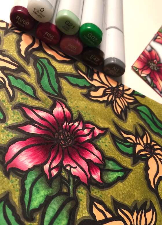
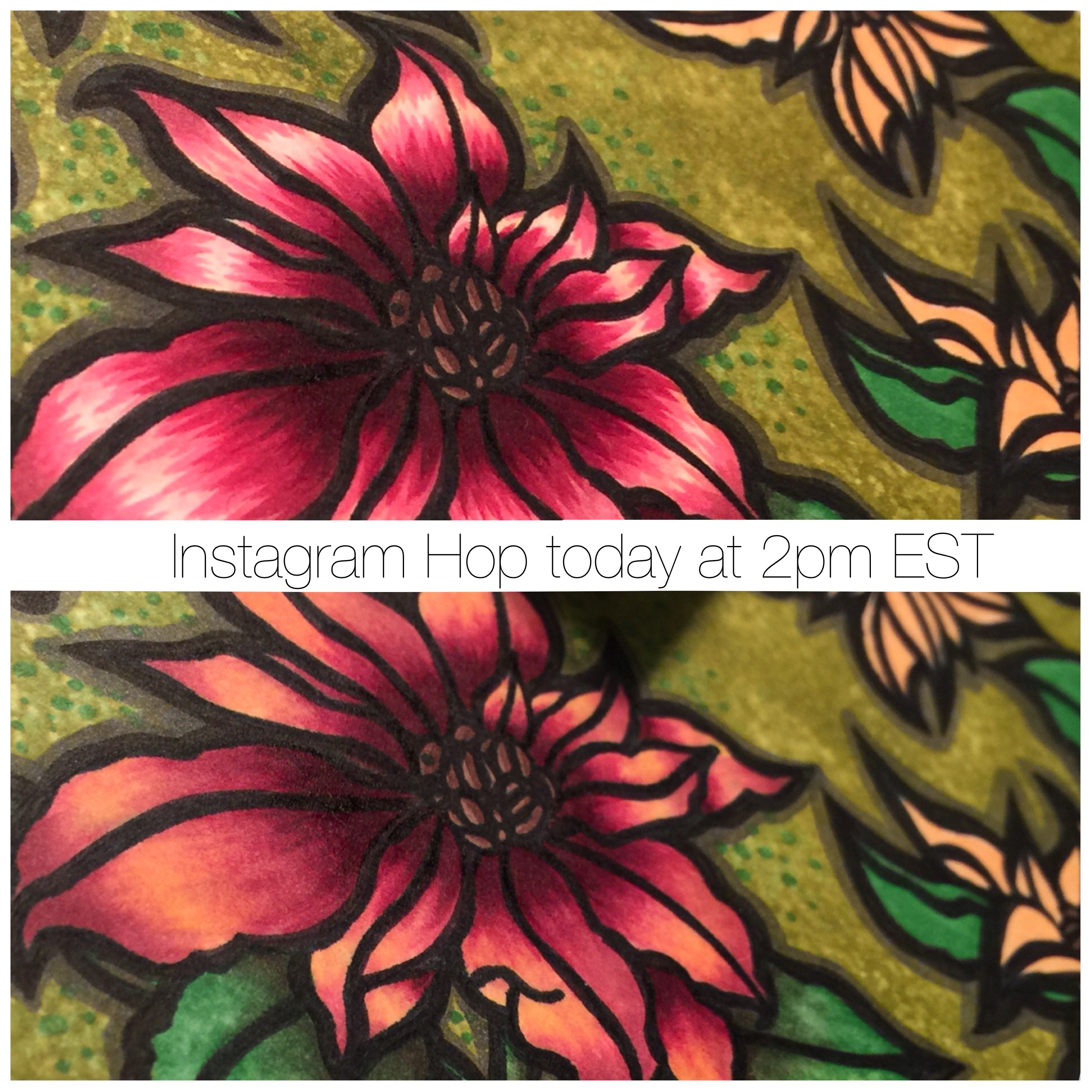
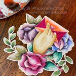
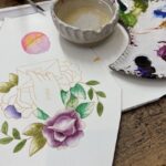
I am in love with these poinsettias from Mama Elephant. I had some fun outlining my stamped images with a thick border of black sharpie. For the main poinsettia I let the feathering show on the petals.
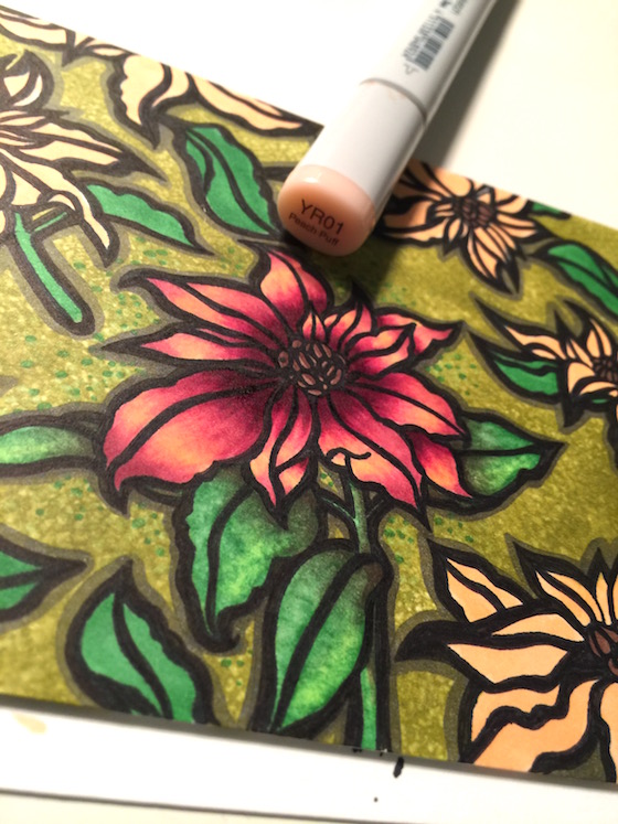
In this photo I gave the entire poinsettia a wash with a light color and this give the flower a softer look. Which one do you like best?
GIVEAWAY: How about a goodie bag with a Mama Elephant stamp. To qualify tell me if you like number 1 or number 2 better.
I will announce a random winner Wed. Nov.14th.
SEE YOU AT 2 PM TODAY FOR MORE INSPIRATION & A DIFFERENT GIVEAWAY. Hugs, Kathy
P.S. A BIG thanks to Mama Elephant for the giveaway 🙂 Woo Hoo
 DAY 3.
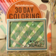 Day 13. Caring Hearts Blog Hop
 Day 15. Paradise Blooms & Winners
I love them both. But #1 wins if I have to choose.
To be frank i love no 6.. but given options i would go with no.2
Love your colouring…
Love how the contrast in the feathered version makes the flower pop, so no. 1 is my favourite of the two.
Marianne x
I like the vibrancy of number one
I love the soft color of number two
I would have to pick ……. number ONE !!!
Don’t make me choose!!! I like them both, but would save number one from a burning building 🙂 xx
2, because everything is better with a friend.
And beautiful poinsettia!
I just love #2!! So pretty!!
Of course I love them both, but number 1 sings to me as it is so vibrant and lush! It’s like choosing your favourite child, you should never have to!!!! Xx
They are both gorgeous, but if I have to choose then the first one, but I love the peachy color on number 2. Thanks for this awesome challenge 🙂
They are both fabulous but I love the vibrancy of no.1.
I love the both, but my favourite one is Number 1.
I love no. 2. It looks much real for me.
Number 2! There are few things I love more than pink and yellow flowers!
I loved tbe first look more 🙂
Both are stunning Kathy but if I had to choose I like the softness of the second.
Hi Kathy, I like both BUT i am always fascinated by how you mange to go from very dark to very light so I’d pick number 1 😉
Oh, Kathy, they both look gorgeous! But I would go for the first one! I find it more crisp and vivid, and closer to my style 😉 Thanks for sharing these! And for a giveaway!)))
My choice would be the soft number 2. I like the soft and delicate look that it gives to the card.
I like number one but both are really nice.
I love them both but I think the second, softer one better 🙂
l like both and cannot choose!! x
Both awesome!! But I enjoy the second one more.
Number 1.
They are both stunning! I think I like the detail on the first one best!
Love the second one!
I love this poinsettia stamp set, too! Love the first one better, colors so vibrant!
Super pretty! I like the first one best. The highlight looks amazing!!
love them both!
both are so pretty! but if I have to choce is tnumber 2.
because its softer.
thank you and a Mama Elephant for this giveaway.
hugs
Beautiful coloring! Love the boldness of using a sharpie, going to try that one.
I do like both, but I would have to choose the first one, it’s just so vibrant!!!
Great colors! I like number 2. Thank you!
Both are winners but number 1 has the edge!
O my. difficult one. No1 is more vibrant but I like the blend of no2 better… both are just as pretty…. I’ll say Number one then!
oooo and I forgot! I LOVE Mama Elephant stamps in general and this poinsettia is absolutely Georg’s!
I would pick 1 I love the glow that it has.
I had to go back & forth so many times to be able to choose because they
are both so lovely. I think I like No. 2 better with the light wash.
I like the number two better. One is lonely.
Oh, you were talking about the cards .. still number 2. Love the coloring.
I love them both but n.1 wins because the vibrant colors are absolutely stunning!!!
Thank you and Mama Elephant for this great chance to win!!!
I Loooooove them both But #1 is my fave!
Ugh! I can’t choose. I like them both for different reasons. I like the play of light on number 1 but I like the softness of number 2.
I like the vibrancy of the colors in #1 BUT both are gorgeous:)
Very close, but I think I’ll go with number two.
Love the first one Kathy!
Both really amazing! Beautiful coloring! But if I have to choose I like #1! Really pretty!
Both are beautiful – but I like how #1 looks 3D.
One of course
Both are so pretty, but I love the softer look of number 2!
#2! Cool way to use this pretty stamp.
I like number one better, thanks for asking
They’re both really pretty, but I like number one a little bit more.
Both are so beautiful. I guess I’ll choose one cause the colors are more interesting.
Love them both,but number 1 has that pop if color.
I love the vibrancy and the textured look of #1
Love them both, but as a more CAS girl, I have to say that the crisper colors of #1 appeal to me a teeny bit more. 🙂
Hmmm…that’s tough as both are beautiful. I’m going to go with #1 because it puts the spotlight on that one flower.
I love #1. The softer one may look better in person, but the vibrant colors of #1 look fantastic.
I love both, but I prefer #1…I am into bright vibrant colors!
Love, love, love #1…!!
The Black Sharpie marker is genius!! How beautiful that turned out. I must try that technique my first opportunity. I’m definitely a fan of #1
Both are so pretty but #2 just jumped out at me!!!! You are so talented.
1 hands down! Love the vivid color of it but both are truly gorgeous.
Don’t make me choose. Well, okay, if I have to, I would say # 1. They are both gorgeous.
In general I prefer the brush strokes on most flowers. In this card I like the blended a bit more. Both are great.
Both are great but I love #1 better
#2 (it always makes me think of me and my awesome hubby!)
I love them both, but if I have to pick, I would pick number 2. Thanks Kathy and thank you Mama Elephant!
Both are nice, but I like the texture of #1 better 🙂
This is really hard. I love them both. OK… then maybe Nr. 2. 🙂
I love both but if I have to pick only one then it has to be #1 because the vibrancy of the colours are greatly enhanced by the use of bold black outlines. The feminine floral colours and forms actually remind me of the oriental prints on the clothes that my mum used to put on when I was a little girl. I do miss her so.
They are both lovely. But since I have to choose I’ll say #1, it pops more.
Thanks for the give away.
Both cards a beautiful, Kathy. I love the thick marker lines around the poinsettias too. That’s a great idea. I like number 1 better. The bold colors just speak to me. Have a great day!
I prefer the softer look of #2.
Love #2!
I’ll have to go with 1 because I like the contrast.
Hi Kathy. I like number 1 better. That poinsettia looks so real!
I like number 1 best but they are both beautiful!!
They are both beautiful, but I like #1 better with more white “highlights” in it. Thanks for sharing!
#2 is my favorite! I like the highlights!
Both are beautiful, but I like #1 the best. The colors are more vibrant and really catch the eye!
I love them both but I prefer the blended #2 more. Love how you mix colors.
Number One, only because I like the feathering that you did. I like the color you used in Number two, but the feathering is not the same, but honestly…they are both stunning!
Both are beautiful and if I had to choose, it’s the second softer look.
I like number one!
Of course they are both really pretty, but since we have to choose I will go with #2
I love the coloring of the 1st one. It gives such great dimension to the flower.
A difficult decision!! I thought I would go #2 because it has more yellow tones (I think everything needs a bit of yellow), but I actually like #1 better. 🙂
Both are fabulous but I think I like #1 best!
Both are gorgeous! but I really do love #1
xoxo Olga
I love both really but if I hav to choose #1 lol. Beautiful coloring!
I like #2 the best.
I really like them both. I would pick number 1 because of the vibrant colors makes it pop just slightly more. I really like seeing the feather strokes. Beautiful job.
I love the feathering in #1. Somehow it looks more “arty” to me (whatever that means!). Love to watch you color, Kathy!
I like the first one best! The bold out lines make it look like stained glass.
I like the POP of color in No. 1 – so that’s my vote!!!
as usual, both beautiful….however, 😉 I like #2 the best. A little softer.
Personally, I prefer the top one. I like that there is a contrast there.
Kathleen Mc xx
I like # 1 better. The colors look brighter and more defined. Both are gorgeous though.
It’s so hard, but I think like the distinct feathering on #1 the best. So pretty!
Both are lovely, but I prefer the feathering of number 1.
Wow – equally gorgeous! Love the softer colors of 2.
Love the poinsettias!! I like them both, but # 1 gets my vote. So cheery!!
I like #1. I always like bright colors. Using the Sharpie outlining is new to me.
Love them both but would pick no.1 if I have to choose.
Beautifully colored flowers. I choose #2
Hi Kathy! I like the obvious feathering on the first one. My hope is to learn how to get that EVENLY feathered look as you always seem to do:))
Being a traditionalist, I prefer the first one. I am enjoying watching you color.
I lik them both but I vote for #2.
Wow!! That’s a hard one. . . but I find I’m drawn to #1 a little more!!
I also think both are beautiful, but I favor number one.
Love them both. I will choose Flower Number 1 by it self is so vibrant and I love the colours.but if it’s with the whole design and the side roses in the card I will choose number 2 it goes more with the other coloured in the card.
I like the #1 because it’s more vibrant.
I love both but #2 is my pick. Happy coloring!!
#1 is definitely my favorite. I love it because of the vibrant colors. Thanks for the chance to win.
#1 is my favorite, I like vibrant colors and the texture from ‘flicking’…is that the right word, lol.
You did a fantastic job of coloring on both but I prefer the first one. It seems to be more realistic looking.
I love the way number 1 pops off the page, so that would be my choice. They’re both gorgeous though!
I love the bright contrast of #1. I also think I would prefer a thinner black sharpie line. Love your coloring!
I love them both; it’s so hard to pick a winner. The first is more vibrant and bold, whereas the second is softer and perhaps more elegant. For a Christmas card, I would go for the first (how is that for waffling LOL ????)
I like the show of the bold highlight in #1.
I love them both but will go with number 2 . The colors are soooo beautiful and guess what? My birthday is Nov. 14th. and I’m still going strong at 82. Love your 30 day challenge and all the beautiful cards it has. It gives me ideas for many of my cards.
Early Happy Birthday. You are an impressive young lady. I’m thrilled to know I can inspire you with new ideas. Thanks for being a part of the 30 Day CC. 🙂
I like both, but the highlite in No. 1 is very striking. So No. 1 for me.
I like #1 the best. more contrast and I like the feathering.
They are both gorgeous but I like #1 best, I think it is more vibrant and the petals have lots of dimension.
They are both gorgeous, you are like the queen of flowers!! I like #2, it keeps the colors, but does blend it and soften it which turns out really pretty!! 🙂
THey are both lovely. If I have to choose one, it would be #1.
I love both, but I like the warmth of #2
#1, love the color
There both beautiful depending on the look your going for and a close up look always changes in the viewers eye but….I’d have to say #1. I like the bold color and how the black defines each color. TY for the chance to have a goodie bag and to Mama Elephant. Good luck to everyone!!
They’re both beautiful, but I think I have to go with 1
They are both beautiful but if I had to choose I would say #1:)
I like #1 better. So pretty! They both are, but I really like #1.
Both are gorgeous poinsettias, but no# i steal my heart with such vibrant colors!
I like the vibrancy of number one – though # 2 is pretty too.
Both are beautiful but I think I like #1 a tiny bit more
Both are awesome but since you’re making me choose, i really like #2 more.
Number 1…love the vibrancy.
My favorite is #1, the highlighting on the petals is really pretty. Thanks for sharing.
Oh I love the yellow on card #2!!!
they are both fantastic but if I have to pick one – i like the vibrancy of #1 best.
Kathy, it’s a difficult choice since both colorings are awesome, but I would choose #1.
Both are amazing, but, I like the brighter color in #1 best. Lovely.
Very difficult choice! The first one pops and the second one is soft and calming. I would use both but when pushed to pick one I’m thinking I’d choose the one that pops and that would be #1.
I love #2 the best, although they are both beautiful. I just like the softness of #2.
I like number one – bright for me!
I love them both, but #1 wins for the brilliant contrast!
They are both pretty, but I like the 1 better. Have a fun hop today–it’s smack dab in the middle of work this afternoon–no desk job or “breaks” for me–I’m one on one with clients the entire time. Hope you all have fun! I’m still trying to get to yesterday’s hop–just run out of time before leaving for work.
Love the brightness of number one. Beautiful.
I like #1!
I love them both but if I had to choose I think it would be #1.
Both are incredibly pretty, but I’ll give #1 the slightest edge *grin* Instagram hop? This will be a first for me, too (as was adding a card into the Day 3 FB group)! Learning new stuff is fun as is seeing all the incredible inspiration!
~carol
I pick #2. Lovely.
I like the brightness and vibrant color of #1 the best.
I love #1 but #2 is pretty also.
Tough choice..I like them both. However I’m drawn to #1 because of how vibrant the colors are.
I like #2. But both are very nice. Love your coloring. 🙂
I like number 1 better: darker in the shadow areas and lighter highlight, causes more contrast in the whole flower.
Oh my gosh I love #1. I love the bright colors!
I love them both, but today I am in a soft mood. So #2 gets my vote. Thanks for sharing.
I love poinsettias period. Brightness wins in this case!
I love number 1
Number 1 – it’s gorgeous and looks like rays of sunshine shining down on it.
i like number 2.
They’re both fantastic, but forced to choose I will say #2.
Both are beautiful on their own but viewing side by side I prefer #1. Thanks for the giveaway.
They are both gorgeous ! but my fav is nr 1 I think because of the white which makes the colors more vibrant and also liking the feathering details <3
I love the bold colors of #1. Lovely card!
I like the second one better with the peach in the petals 🙂
This was a tough one but since I must choose, I pick #1 because I love how the white that is left in the poinsettia really brings out the lovely reds.
I like how bright and bold the first one is!
Love version # 1 I love the streaks ofcolour blending are so pretty. Looks fabulous on the flower petals.
I like #1 the best but both are beautiful.
I love No. 1 more because of the bold outline. The poinsettia also pops more in the No. 1 than in No. 2. Not that I don’t love No. 2 also …. LOL
Number 1 is my pick!
I like #1 better, seems much brighter.
Both flowers are gorgeous but the pure vibrant look of #1 really caught my eye. Love your awesome coloring!!
I like #2 because it better matches the rest of the coloring.
Love them both but no. 1 is my favourite
NUmber 1 is my favorite, but I like 2 also.
Tough choice, but being a “tropical Florida gal” , I go with number 2, It’s sunnier and warmer feeling… Love them both
Both so pretty, no 2 is mine;-))m
I like the #2 better…I don’t like to choose first, it’s always been a hard thing for me. Going 2nd is easier
Perfection as usual! I chose number 2 but both are fabulous!
Hard to say but I guess #1.
Hey Kathy, I always love all your coloring but as I see these right next to each other I guess I like the first one the best. It was hard to choose though….
Thank you Kathy and Mama Elephant for today’s give away!!!
Both of them looks pretty… but i like number one best. I like the feather stroke…
So fun to be part of this colouring challenge.
I like #1 better because the shading and highlighting make it look almost 3 dimensional
Hard to choice one over the other but if I have to I’ll say number 2. It’s a softer/calmer version.
They’re both lovely, but I prefer the soft look of number 2.
Good morning Kathy ♥ It’s only 7:50 a.m. here, so going on 8 a.m. eastern time. I’ve never done an IG hop. What is that? I’ll try to figure it out lol!!! I love the poinsettia you did with the touches of yellow? on the petals. Not sure if that is one or two. Thank you Mama Elephant and all the sponsors this month >’x'< aloha!!!
If you have an IG account just start from my blog post for today. There is a list of hoppers. Just click on a name and go look. Come back to my blog post to click on the next name. That’s probably the easiest. If you don’t have an IG account it’s easy to get one for free. Hope this all helps.:)
#1. It just seems “brighter” with the lighter highlight
Gorgeous coloring
on both and I do like
the second one better
Carla from Utah
So hard to choose! Both are beautiful but number one so vibrant so I’d pick that one 🙂
Number 1 is my choice but they are both really pretty – just love the background.
Really?! I have to pick a favorite? I read it twice because I was sure you did not really mean to pick one? I love the fisrt one, the coloring is so great. I also love the second one because it is softer and meshes with the softer colors around it. I guess I clearly can not pick….I love them both but will choose 2, even though I love bright colors that pop…mmmm… So hard to make a choice!
I like number 1 the best! They are both beautiful, but I really love your feathering-it’s so perfect! I feel the feathering really makes the flower pop!
#1 Rocks for me!
#1 is my choice – it seems more vibrant!
The colouring in both is fantastic!
I like both. If I have to choose one, I guess the first being more vibrant.
I prefer #1. I like the contrast of the highlights.
#1 is gorgeous but it somehow just doesn’t look right with the surrounding images… maybe because its the only thing colored that way? I find #2 more pleasing to the eye *overall* based on the background. But all bets are off if you had colored the flowers and leaves similarly in #1, cause that sure was pretty!
#2 is so pretty. Love the soft look.
I love the softness of #2, but the way that #1 pops against the others. Hmmmmm…. I guess if I had to take sides, #2. 😀
They are both very beautiful but I am kind of leaning more towards number 1.
Number 1 gets my vote ,Both are BEAUTEFUL !!!!
I like number two the best! I just think it looks more like the real thing!
Of course they are both very beautiful but I like number 1 just an incy bit more.
I like number one! Nice and bright. Excited about my first time on the 30 day challenge!
I love the bright colors in photo #1. Gives it such a nice POP of color.
I think I like the first one best, probably because the colors are more striking. But, I really like the second one because it looks more realistic. They’re both beautiful. Your coloring hits it out of the park again. Beautiful!!!
#1 is my favourite though they both look gorgeous and realistic!
♥ Both versions are really wonderful, but the first i prefer a little bit more. So my favorite is Number 1.
Many hugs
Angela
Both are so pretty but I pick #1.
#1. The highlights really make it glow and it’s so bright and gorgeous. More contrast too. Definitely my fave.
They are both lovely but my favorite is number one, I love the vibrancy!
They’re both beautiful, but I like the feathering in #1 more than the soft look.
They are both stunning but I think I would have to choose number 2. It has a kind of warm glow.
This decision depends very much on mood and time of day. #1 is more vibrant and positive, very morning get up and go feel. On the other hand #2 is more mellow and laid back, a sort of dreamy end of the day feel. This means I get to like them both equally! Thanks for sharing your lovely work and super tips.
You know Kathy, I can’t pick a favorite because I like them both for different reasons…#1 is very bright and appears more dimensional and is very ‘center stage’. #2 is much softer and no one element is competing with another to be ‘center stage’ so it gives a very ‘overall’ cohesive look. Sorry just can’t pick! Thanks for the inspiration!
Blessings,
Melitta
Big time vote for #1
Both are beautiful but I like the vibrancy of the colors on number 1! Thanks for showing different techniques on each one!
I love the first one!! It’s beautiful!! Your coloring is always an eye candy!!
-Berina
Moxie Craftie
My opinion (for what it’s worth!): I like the second one. It helps tie in the color of the primary image into the others. I think there is enough boldness in other elements that the colors of the flowers don’t need so much contrast. Thanks, Kathy. PS Now I know why you commented on my “too many bloghops” comment! (big grin!!!) I finished yesterday’s while I ate lunch today. I will be doing good to start this evening on today’s after the grandkids’ soccer game! Off to watch kids run.
Both are gorgeous, but like the bolder color in #1.
Love them both, but I would choose #2. I like that they don’t look as “shiny”.
Both are beautiful but I liked number 1 better, the white space makes it look more vibrant.
They’re both lovely, but I like the brightness of #1. Thanks for the challenge and giveaway!!
I love number 1. They are both so pretty, but I prefer 1.
I think both of them is gorgeous but if I had to choose it would be 2. I wish I had your talent.
Number 1 for me!
I love the first one as I’m a more traditional poinsettia type of girl!!
Hi Kathy, I’m a newbie to colouring in really enjoying being part of the colour challenge thank you. I really love the first flower number one it has alot of depth it jumps out at you, and it almost has a real shine to it, its the one that pulled me in first x
Welcome to the 30 Day CC. I’m thrilled you found me and most of you are enjoying coloring. The key of the challenge is to find special time just for you. Thabk you 🙂
Welcome! Great to hear how much uou are enjoying the coloring challenge. Continue to find that special time just for you.Thank you for your kind words and support. 🙂
Love both images especially with the extra dark outline. I love the vibrancy of the colours in number 1 but the smoothness of the blending of colours in number 2. I think number 1 would win my vote if I had to choose.
I love them both but would go with the first if I have to choose. It somehow seems more vibrant to me.
I love them both but choose the first if I have to pick only one. It somehow seems more vibrant to me.
Both are beautiful…but I think I like the softer look of #2 best.
I would go with 2. I’m a soft and subtle woman so the more blended look appeals more to me.
Vibrancy of no. 1 wins for me!!
They are both lovely in their own way but I go for No 2 as it is softer.
Rene from OZ xo
I think I like the shade of red in #1 a bit better
Number 1
Both are beautiful, but my favorite is #1
If I created any one of them I would be extremely happy, but I prefer the vibrancy of #1.
number 1!
Lovely colours. Both fab but 2 gets my vote
Lovely colours. Both fab but 2 gets my vote
My preferance is number 1, but love them both.
They are both lovely Kathy, but I prefer card 2. Thanks for sharing.
Oh Wow! I believe after much thought and looking, I like number one the most!
i love them both but f i had to pick it would be #2. thanks for all you do.
I truly have to say I love #1 the best, it is much more bright and vibrant. thank you for the chance to win.
They’re both fab, but I’d probably go for #1 – I think it’s the brighter highlights I like.
Both are gorgeous but i prefer the shine on the 1st one. Now I wished i’d seen this post before colouring my poinsettias!
I like #1 better but both are great! Instagram hop was fun would say easier I could visit them all
I like number two best because it looks so good with the background colors.
While this is lovely, I have to say I like the other one more. I like the sharpness of the flowers and pop of them against the white background.
Both are beautiful, but #1 gets my vote!! Thanks!!
I can’t choose..don’t make me choose…I love both!
Hard to pick my favorite as I love both…the subtle look to the second one has a very slight edge over the first one!
I pick Number One!! They are both stunning but i love the feathering on the petals!!
They are both beautiful but I like 2 the blend is nice on 2.
As far as I am concerned all of your work Kathy is my favorite but if I had to choose which in this case I really really want to be a winner I have to go with one. It’s brighter and to me like you cheerful.
AWW thanks, 🙂
Beautiful! I like #2 better, but only because you are making me pick. 😉
It’s tough. But I’m going with number 1! I like them both though
Both are gorgeous, but I’d choose #1 as my favorite!
I think I like #1 the best but they’re both sooo lovely!
Hi , I really didn’t have to think hard or very long for this one . I love #1 hands down ! I love the feathering it really adds a special touch !
Angela
I love #1! The vibrant colors are stunning and just pop off the page, showing off the beautiful details!
Oh I definitely like #1 better! So bright! Love this! 🙂
I like 1 best. It reminds me of the poinsettias growing wild in our yard while living in Kona, Hawaii. The petals were highlighted by the Hawaiian sun, especially in the morning hours. Lovely!
I like both, #1 for it’s volume and #2 for it’s softer colors… Overall #2 looks more realistic, so I’ll choose #2!
And thank you for sharing both versions, Kathy, your coloring is beautiful!
#1 is my favorite – just on personal preference. Thanks for the idea of using a sharpie on the outline, Kathy!
#1 is my favorite because of the brighter highlights!
I like how distinct the highlights are on #1. But they are both stunning. Truly.
#1 I would have to say but you make it really hard because I love them both.
Both of them looks good but #1 for me because it looks a lot more bolder than the 2nd one.
both are lovely, my prefernce would be #1. . . really like the strokes. . . .
These are both absolutely stunning but I chose #1 because it looks more vibrant. Your colouring always amazes me!
Both poinsettias are beautiful but I like #1 a little better for Christmas. It’s so vibrant 🙂
I love them both, but I love #2 a tiny bit more because of the color combo. Thanks.
Poinsettia’s are my favorite holiday image. I think I would have to say that #1 catches my eye more and pops. Both are beautiful!
I love poinsettias!!! Your coloring is so lifelike and choosing one is difficult. But if, and only if, I have to pick one, I’ll go with #1. Thanks for the inspiration.
Not fair making us chose. Both are great.
They are both pretty, but I would have to pick number 2.
I would not throw either away, both beautiful but I do like the more subdued look of #2 better.
I like the vibrancy of no 1.
Both are absolutely stunning but I’d have to go with number one. Love the more vibrant colors!
I like the softer look of number 2.
Today I prefer #2 because I’ve been running around all day and need to chill out a bit. Tomorrow, I’ll be rested and probably need a pick-me-up to get my energy back on par so I’d go with #1 then. Time, place, circumstance all make a difference in my card choice. I wouldn’t put either in recycling, though. They’re both keepers.
I love #1. The white accents just pop more to me. Thanks for the inspiration and chance to win a cool goodie bag. 😀
Gah! That’s a toughie…I like the boldness of #1, but the softer maybe more realistic look of #2. It’s like your kids, no favorites allowed!
I love the color pop of #1. Both are beautiful but if I have to pick, #1 gets my vote.
Both gorgeous but I like #1 the best!!
Love them both❤️️ Number 2 is my fave!
I like #1 best, but both are lovely
I like number 2!
I like #1! Those rich colors remind me of velvet! Makes the poinsettias look so beautiful!
I like number 1.
Hi Kathy!
I usually prefer bold and crisp colors on projects. On this Christmas themed piece I like the 2nd option more. It is softer looking and reminds me of all of the overwhelming love I see in the world especially at Christmas.
Thanks for the chance to win! And thank you Mama Elephant, too!
He-IS-Able!
Traci Starkweather tracistarkweather@gmail.com
I love them both and there is nothing wrong with either. The first one though pops out more then the second one. It’s more noticeable if you know what I mean. Would I not like to receive the second one in my mailbox? Of course not. You asked and I told you. I didn’t get to color today. We didn’t go to see my dad for very long so I brought my library book and I finished it. 1 down and about 10 more to go! LOL I love to color and I love to read. When we go visit my dad, he’s not much of a talker and he doesn’t hear to well (he refuses to wear his hearing aids) so I bring something to do. If I don’t, I am watching TV and sometimes I fall asleep. I am making some amazing Christmas cards and I will post them on your site. I really like you’re coloring and I love Mama Elephant. Thanks for letting us win something!
Your cards are always beautiful Kathy. I like both but No 1 is sharper :)) and like that. Happy day
Um… both are awesome! And my win is 1st one! 🙂 Just love the color pick!
p.s. Thank you! & Mama Elephant!!! Woo-hoo!
I had to look back and forth at the photos to try and pick one, but it was hard to do as I really like them both. But if I must select one, I guess it would be the feathered poinsettia in Photo 1. TFS.
Hey Kathy, number one is my favorite:-)
They both are beautiful but if I had to pick just one I think it would be Number One (1)
Kathleen
Number one….the contrast is really gorgeous
i like no.1 as i like bright or bold colors and the touch of white makes it bright. no.2 reminds me of vintage….. smiles for all your coloring and mama elephant rocks!
Your colouring amazes me! Both are beautiful, but I’d go with number 1.
I like the softer #2
I love how vibrant the first poinsettia looks but they both are beautiful. 🙂
Both look absolutely stunning! Love the colors you’ve chosen. I think I like the first a tiny bit better because of the detail.
I like both but I would choose # 2
Love #1
Number 1 really catches my attention. The poinsettia just jumps off the page. I do love poinsettias
I love #1..I love those colors
Jeez, decisions, decisions…LOL
Awww…..They are BOTH beautiful. # 1 looks brighter so I’ll go with that!
Both are beautiful! Thanks for the Instagram hop! I am loving it, and it is faster than a blog hop when one is short on time and still wants to color!
I like #1.
Love both, but right now I love #1 just a bit more!
I prefer # 1. Color is a lot brighter!
Both are gorgeous but it is #1 for me. Loving this stamp and your coloring is spectacular!!
I really love them both, but like no. 2 a little better because of the way the subtle last layer blends the color.
I love them both but I am drawn to the softer tones in the second one.
Number one is my favorite, although they are both gorgeous. I love how bold your coloring is. I feel as though I can spot a Kathy piece immediately. Distinctively, vibrantly you!
Beautiful Poinsettias. Love the coloring. From the Pro!
I prefer the 2nd with the softer blending – but both are beautiful!
Beautiful, like the bright one
Number 2
I think #1 because it has some shine in it.
I like #1. Nice and bright!
Since I only have two choices I Love number 2, however they all are great
Both flowers look great. I prefer the one with the feathering.
I live them both but the brighter of the two really catches my eye!
Both are beautiful . #2 if I must choose .
Please don’t make me choose! LOL Honestly, Kathy, I love everything you do (seriously)!!! BUT, since you want me to pick one, I’m going to have to say the first one (with the flicks showing). They’re both just gorgeous though!! (And thanks to Mama Elephant for the generous prize!)
Both are very pretty but I like the first one with the distinct flicking is my favourite.
They all look awesome…but I do really love the feathering!!
I’m more comfortable being #2.
thanks.
So pretty! I think I like #1 best, I love the contrast!
It is difficult to choose, I really like them both. Euhm, maybe I like number 1 a bit more.
I love the 1st one as I like bright & vibrant colors!
I love the soft color of number two
I like #1 the best.
The number 1
I # 1
Option 2!
I love these poinsettias with the thick border! The second is my favorite, and I am loving this challenge. Thanks for all the fun.
Hi Kathy. Both are beautiful, but I like 1st one more. I love bright colors! :o) Thank you so much for the opportunity to win ME goodies and for the inspiration. :o) Big hugs!! :o)
Oh, it’s so hard to decide! I like the little pop of white on the petals in # 1, but I also like the more natural, the smoothed out colors in #2…. I still think I prefer #1 jus a smidge more. : )
I like the one with the soft wash of color.
I prefer number 1 😀 Hugs xx
Wow! Beautiful colouring on both. Love the first just a little more though.
Wow that is gorgeous!
The first one is the colors that I most associate with you–or you use a lot;) however they are both beautiful!
Kathy, you are the coloring queen! Your coloring is stunning! I love both poinsettias, but would have to choose #1! Thanks for the inspiration and for the opportunity to win! Happy coloring!
Both are gorgeous, but I prefer number2.
I love them both, but #1 is my favorite. I so enjoy watching you create such magic. Thanks for all the great inspiration.
#2 is my favorite
How beautiful are both poinsettias! But I prefer the bold colors from the first one.
Both pretty but like #2 a little better
more depth
I like the vibrancy of #1
Gorgeous coloring! I love the first one due to the higher contrast!
Hi Kathy! I like 1 better but both are gorgeous. Thanks. Hope I get to play!
I like no. 1 best. I’m for bright and bold for poinsettias.
I like #1! Beautiful!
#1
Love them both, but the softer look of #2 is my favorite. This stamp is gorgeous.
If you’re really going to make me choose….lol….I also like #1!
I love both of them….. But if I’d have to choose, I would say number 1 ❤️
Stunning colouring! I think I prefer number 1 as the colour of the flower is brighter!
#1 is my favorite. Both are gorgeous though!
They are both very pretty, but I prefer #1 .
🙂
I love your work…My favorite is #1. I think it has a brighter look.
They’re both GORGEOUS!!!
Today I prefer #2, the softer colour is like a warm hug for my eyes 🙂
Both are great but I prefer the clean white background in number2. Thanks.
These are both beautiful but for me I think No. 2 with the softer look is the one I prefer. x
I like both but I choose No. 1.