Hello Friends, How was your weekend? We had a great weekend but, it was busy with a fun rehearsal dinner, spectacular wedding, brunch and a Sunday night dinner lol. It was a little hard to keep up and I am itching for a long coloring session.
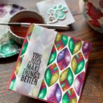
I was gifted 4 wonderful coloring books so I tore out one of the pages for some distress ink watercoloring & set aside the other three to giveaway to three winners.
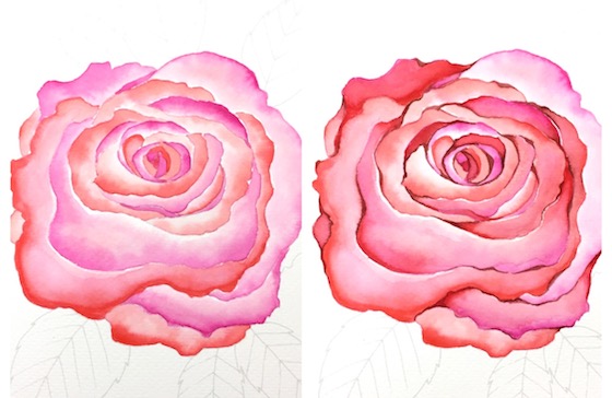
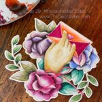
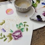
My flower isn’t finished but, its close. The flower on the left was using two distress ink colors but, don’t worry about what colors lol. Use what you have
The flower on the right is after I added some lines and some tad pole shaped lines.
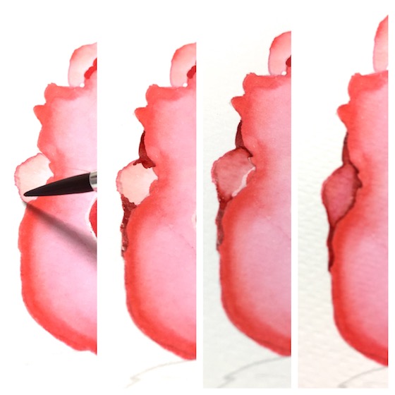
Here is an example. On the left I am getting ready to add the line with a brush and a darker color of distress ink. You can see how that area progresses with water and blending it out.
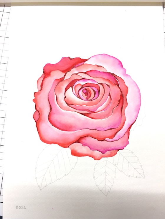
Just adding that detail to different sections of the flower make a big difference. Ohhh I can’t wait to finish this.
Even thought my flower isn’t completely finished which one to you like better? Just curious.
GIVEAWAY: If you tell me “right” or “left” in the comment area that will qualify you for one of the watercoloring books. I HAVE THREE of the watercoloring books to giveaway. The winners will be announced Sunday the 10th.
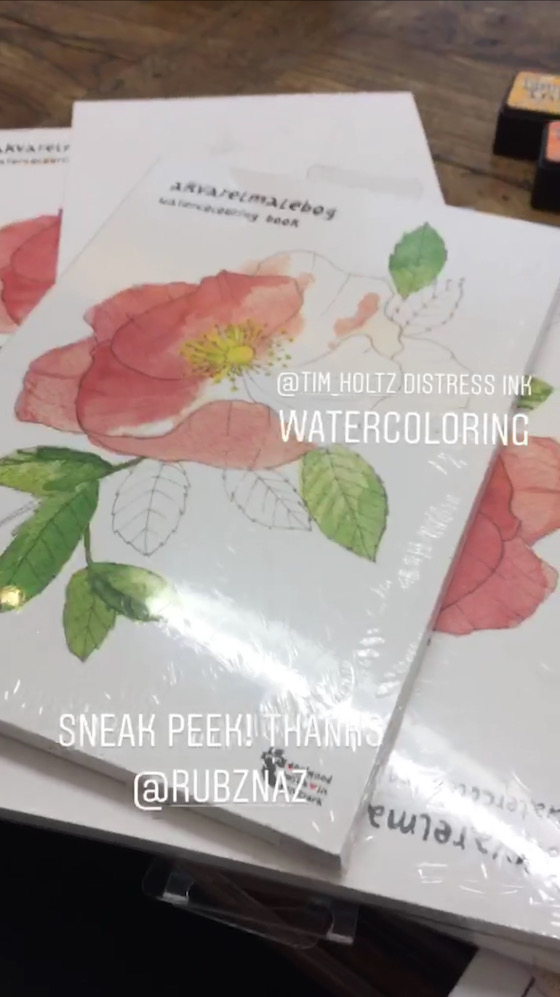
Thanks Ruby for donating three of these beautiful books to giveaway.
I will be back for a blog hop tomorrow. Thanks for your visit! Hugs, Kathy
 Day 5. Washi Tape Background
 Day 17. Using A Holiday Stamp for Everyday
 Day 26. No Line Coloring
I like the one on the right. pretty!
I like the left one.
Love the added colors on the right rose.
I prefer the right one too! So gorgeous painting!
The rose on the right!
I prefer the right as well. Looks more dimensional. Colors are awesome.
I guess the right one. But they both look very pretty. Wow. Watercolor coloring books sound like the perfect thing. It is hard when it comes to watercolors to be able to use just any old image you have.
Right
The right one, there is so much more dimension and depth.
I can’t pick right or left. I really really like them both. Love the softness of the one on the left and I love the deep shadows and depth of the one on the right. I guess if I have to pick just one…I’ll go with the one on the left (only because I love the looseness of watercolor and can see a good deal of it in that one ;-)) ♥
Right
Right! I feel the color order gives it more depth. Both lovely!
We’ll this is a tricky one Kathy lol! I’m drawn to the right rose as it has more dimension. But also love the softness of the left rose . These colouring books look wonderful how kind is Ruby! Xx
They are both so very pretty – but I like the one on the right. 🙂 Thanks again for hosting this challenge.
For me they are all so pretty. I love the soft on the left but also the more darker color on the right.
I will say “right” but both are really gorgeous, truth be told! Of course, the additional detail really makes the flower more realistic, but the one on the left is so dreamy LOL
It is actually hard to chose for different reasons. But I’m going to have to go with the right.
Left for sure..the petals are more defined ! I too love to color with distress inks .I follow you tips about nooks n crannies to get more Deapth !
Beautiful coloring! I like the right one . Looks more realistic 🙂
i prefer the flower on the right.
I love the right- the depth and highlights stand out especially with the way you coloured this beautiful rose.
Left for me, I like the softer look
I pick the right flower. I love what you added to it to give it more contrast. Lovely!
Both are beautiful, but I like the one on right better with its nice contrast. I shy away from using darker colors, but this is a nice example of how much they add.
The one on the right. As soon as you add the squiggles worms it defines the petals. Love it. Using no line is beautiful but there still needs to be someway to define each petal and thats what you have done perfectly. So good to see things going so well Kathy xxx Aileen
Right one! But it’s gorgeous anyway!
Right! That kind of depth is what I’m still trying to figure out – thanks for the tip!
I think the shading on the right brings this beauty to life! Thank you for the close up pictures, too. You are so talented, Kathy. 🙂
I’m drawn to the one on the Right!!! Beautiful!
I like the one on the right better, although they both are beautiful!
I like the one on the Right.
The one on the right is beautiful!
Both are nice, but I like the one on the right.
Gosh, both of these are beautiful and it really depends upon the project you would be using it for…
For my personal taste, I would choose the one on the left because it is more delicate and lighter.
Thanks for the chance to win!
I like the one on the right with the deeper color. To me it shows more about the light in the objects and makes it stand out more
Your work is always so gorgeous, Kathy! I prefer the one on the right. Thanks for the chance to win!
The Right one would be my right pick! Love the coloring challenge! You are awesome sauce!
The right one – but it was a really hard choice!
I like the one on the right. It is a bit brighter. Thanks for chance to win!
I like the one on the right as it’s brighter and would hold its own when put on any background. Thanks for this opportunity to win and, above all, to learn different techniques!
I like both but I prefer the right side I think. So beautiful flower.
I like the depth and dimension of the right flower
The right one!
First, let me say, I can hardly believe you only used two colours on the rose on the left side. Do you know how over the moon I’d be if I could do this? Copics scare me. Why? Because I want to be able to use them properly. Yes, I know it takes practice, practice & more practice. 🙂 I own a few but not enough to blend well with I don’t think. I have to say my favourite one is the one of the right though. Both are glorious in their own way!
Left! It just pops a little more. The right is nice, but I like the left a little more. Beautiful.
Gosh that is a tough question. I love the one on the right… but sometimes I really like softer watercoloring, so I can picture that a card done like the one on the left would be exquisite…
I am drawn to the one on the right because the dark areas help everything to pop. However the left one does have such an ethereal feel to it. If I have to choose, I guess I’ll vote for the one on the right. Regardless, very pretty work with only 2 colors! Goes to show you don’t need 100’s of Copics to produce art!
Definitely the right. Love the contrast between lighter and darker.
Both are beautiful but the right one wins by a nose. You do such beautiful coloring and shading.
I prefer the detail on the right…
The right one! This is my 1st time coloring with your challenge. Will post a pic of my 1st attempt later today. Thanks for a chance at one of the coloring books….. 🙂
Right
I love the one on the right. But as I hear colorist say all of the time, it depends on what look you are going for as to know when to stop. I like the contrast and I feel with practice I am getting better at that. Thanks for always encouraging us to just color.
Added detail on the flower on the right is better with all the dimension it adds.
I love the rose on the Right.. Kathy what is the name of this book?
I love the detail of the right side rose❤️
I like the one on the right. Both are beautiful.
I love the flower on the right. So much more depth and dimension.
The right one! But both are beautiful as always.
Your coloring is so beautiful. I love both, but the one on the right is my favorite.
I like the one on the right…
Right….Your flowers are always so fabulous! I can only hope one day to color half as good! 🙂
The detail on the right takes it to the next level! Beautiful!
They are both lovely, but I prefer the one on the right.
Beautiful!! I love the flower on the right!!
Left
The right looks more vibrant and alive.
Like many of the others, it’s hard to choose! They are both gorgeous, for assorted reasons. If I had to pick one I’d choose the one on the left, for its softness.
The rose on the right has more depth, to my eye. Looks more realistic. Both are beautiful, but I prefer the one on the right. I never head of tadpoling, so, thanks so much for the great new technique. You’re the best.
Both pretty. My vote is for the right.
Can I say “both”? I love the depth and detail of the one on the right, but the softness of the left one is also beautiful. I am actually leaning more to the left at this moment, but 30 seconds ago I would have said ‘right’! Love the way the shades of color compliment each other. Altogether lovely. Thank you.
Kathy, with your fascination for details, I can’t imagine you ever leaving the rose on the left without somehow adding more finishing touches. I vote for the flower on the right. Thanks for your inspiration, as always!
Right! Love the depth this one has.
I love the right one. It has more details and makes the flower pop more. Love your work Kathy!
Hi Kathy
I love the contrast of the rose on the right.
Rolanda
Right for sure! What a beautiful technique
It’s so hard to choose! Both are beautiful. I think the one on the right is winning out for me, those added little details are spot on.
Right.
I like the right side. It is more pink and love roses that are pink!
Right. Very awesome technique.
I like the right one – a little more vibrant 🙂
The right one sticks out to me!
The right one just has that perfect “little something” that makes it gorgeous!
Gorgeous! It’ amazing the depth that is created with the additional tadpoles :). I like the one on the right and hope to move my coloring in that direction.
Roses are my favorite to color!
Your coloring is absolutely amazing and so stunning!! I truly love the right one <3 thanks for doing such an amazing giveaway!! So kind and generous if you
Both are very pretty. I prefer the one on the right as it has more detail. Thanks for sharing, Kathy.
Both have their merits. I tend to err on the side of spare, but I love how you do your nooks and crannies. In fact, your process is nudging me to do a little more on my pieces!
Right!
Definitely the one on the right.
I like the extra colouring on the one on the right.
A definite ‘right’ from me, because the rose on the right looks more dimensional because of the darker shading.
Marianne x
I like the one on the right! I can’t wait to see this rose is finished. Have fun!
Although I like both, and although both versions are lovely, I’m attracted more towards the one on the left…I love the gentle, soft subtle colours, hues and tones on the left one. So beautifully done – both of them!
The right
Definitely the RIGHT one:)
Right love. I’m sure the book is incredible.Im so,so busy.Trying to squeeze you in this Wednesday, fingers crossed.Love the challenge always.
Both are beautiful. The one in the right is my favorite, though.
Right! Really pops!
As I have said I love flowers and the rose is my favorite. I favor the one on the right’ It has more dimension and seems to pop.
Of the directions are to do with roses then I do adore the detail on the more advanced rose on the right of my screen, although if I could achieve then level of the left one I would be happy. If it’s to do with anything else, then I’m right handed so I would pick right lol.
Thanks for today’s pics ,glad you had a fab wedding and enjoy the colouring time x
Right, as the color is more vibrant.
Both are just gorgeous!!
The right seems to be the popular choice and I would agree. Love the greater depth of color.
My favorite is the rose on the right.
LLOVE THE RIGHT SIDE . LOVE THE LOOK .
I think I like the left! But both are beautiful!
I favor the one on the right. I just love the contrast in the color.
Definitely right! So much more beautiful detail!
The added touches on the right hand rose made it pop and look really realistic! Great job, as usual.
The one on the right.
I have to say right!
Right. Thanks for your inspiration
The right one, for sure. Those details take it to artist level!
Pr for th flower on the right, Kathy. More realistic in its shading.
RIGHT!! I wish mine came out as good as yours!!! Dont’ worry I’ll keep trying!!
The left!
Right. More definition
I like the one on the right. That extra step is what I miss when I try to color something.
Both are pretty. But I prefer the detailing on the right flower. Thanks for a chance to win.
The one on the right, but both are so pretty!
I like the one on the right. It’s that little extra step that my coloring always seems to be missing.
I like the left one, the more pale one. Not sure why. I think that’s basically how I think of watercolors.
Right! Love all the depth with this one, Kathy!
The soft and dreamy flower on the left!
Love the detailing on the right rose
Right, though both are pretty
Both are beautiful … but the right does have more dimension … so I’d swipe right!
I vote for the one on the right.
Both roses are beautiful. The distress inks are so very nicely applied and I appreciate your tips for adding depth to the rose on the right. My choice would be the rose on the right. Thanks for the inspiration!
Right. What depth it adds.
Right! Love all the depth with this one ❤️
I love them both, but if I have to choose I’ll say right.
Thank you so much for sharing that tip. I love learning!
Right!!!
If I hadn’t seen the one on the right I would have thought the left was perfect. The right just seems to have more depth which I really like
Right!! Love the shading and the depth that you can achieve!
The flower on the right. Thanks for the tip you gave today. I’m going to try it out.
Right!
The one on the right!
They are both beautiful, but I like the left a little bit better. Thank you for sharing!
I personally like the one on the right side!
Looking gorgeous and
I like the right one!
Carla from Utah
I like the one on the right best! Beautiful!
I like the right one better but they are both lovely.
Love them both, and please don’t make me tell you that the right one is my fave! Lol…. Thanks for sharing!
I like the one on the right. I love bright colors.
They both are gorgeous but I love the one on the right the most. Going to try this technique too thanks for the tips!
Definitely the right!
It’s the right rose for me…I love those vivid colors! Beautiful. 🙂
The right for its depth, but the left has a pretty softness to it.
Definitely the right! And I can really see how the added marker work in books and crannies make that flower pop off the page. Going to try that tonight!!
Right one for sure. It grabbed my attention RIGHT away! 🙂 I have been coloring each day since June started but have not taken the time to post or tag anything but I am really excited to try to color or craft for at least five minutes a day! It does make me feel almost as good as running. 🙂 Thanks for inspiring us!
I love the one on the right, there is so much depth and color.
Wow.. simply awesome coloring. The right one looks more finished. But i like the left one bcos, it will be an achievement if i can get that finish . And now, its my goal for the daily marker challenge to be able to paint my rose like that.
Right…of course RIGHT! So much depth.
I prefer the right!
I like the deeper colors on the right.
Right
I like them both, the left is a softer more subtle color. But I love how the added color gives so much dimension to the flower.
Right, but I love them both. The left is softer but the right is more vibrant.
The right!
The one on the right.
Right
The right. Although I may be scared to do this myself!
Right. I really like the mix of colors on that particular flower. And why do you make us choose! Your work is every so lovely – thank you for the chance to win!
Im a lefty but i have to go with the right side on this one. They say if ur lefty u use the right side of ur brain more.. .so maybe thats it? Lol. Both pretty but im loving the right.
I love the right one because of the definition, but the left one is really soft so it’s hard to pick a favorite :-).
Right…it has more depth
The flower on the right feels more dimensional and pleasing to me. Thanks for the coloring tips.
right -love the contrast of the colors
They are both stunning but I love the extra shading on the right
The one on the right seems to jump off the page… beautiful work.
I like the right one better. So much more dimension. They are both beautiful, though.
I like the one on the right. Thanks for sharing.
Love both but I will go with right.
Left…. has a vintage look…. or right…. detailed and bold. Must we choose? I can’t! ♀️
I love the one on the right!
Definitely, the right one.
I’ll choose the one on the right if I must choose. I love the flower on the left as well. Two very different looks that are both quite pleasing.
Definitely the right one. That little color gives the rose so much more dimension. Yet another beautiful piece of art by Kathy!
I love them both but the one on the right really catches my eye!!
I like the one on the right. It has more depth, more contrast and is more bold.
The one on the right, it looks so real!
Right!!
Oh my word! That rise is beautiful. As someone who loves to colour florals your colouring has just inspired me to take out all my floral stamps and start colouring
Of both the coloured images, I’d go with the one on the right. Those deep colours and those layers just call out to you
Thank you so much for the giveaway 🙂
Left one 🙂
Right! I love the details on it!
I like the one on the right far more, there is a lot more depth in.
This is my favorite flower, the rose in all there gorgeous colours.
Thanks Kathy and see you tomorrow.
Kathy, I love the flower on the right. The lines and tadpoles you added to it really made it POP! Its so pretty. Hugs, treen
Right – but only because I’m shortsighted so I like the extra definition from the lines. They are both really beautiful though
Both absolutely gorgeous but I have a slight preference for the right.
The one on the right has more contrast or “pop” but I like the subtlety of the one on the left.
I love the one on the right, the petals are more defined. Beautiful coloring Kathy! TFS
Both flowers are gorgeous. But I will go with the RIGHT!
Right!
Hi Kathy! I like the right one, I find more contrast on your coloring 🙂
OOOhhh my goodness, both roses are lovely.
Mmmm..I think I like the one on the right the most.
Both flowers are wonderful. I love the one on the right … has the depth I seem to like.
Love them both but the one on th right is my favorite!
Right! Those details add so much to the design! It looks awesome!
Like the rose on the right. Beautiful!!
like the right one… trying to imagine what else you’ll add.
Right for me please–but they are both gorgeous–just like the colors best on the right. I’m enjoying the coloring challenge, just need to post some photos. Thanks to the donor of these great watercolor books–so fun!
“Right” for me! 🙂
Thanks for the chance to win!
Both are gorgeous. The left one would be better when wanting a softer look. But I really like the right one because it shows a lot more depth and looks more realistic!
i’m going with the RIGHT ’cause i like the extra detail.
Right… tadpoles for the win!
Right. More detail and depth. The left is great too. I couldnt achieve the beauty and talent you show in both.
Thx Ruby for the extras. ❤️
Oh the right one! Pretty!
I like as much detail as possible in my watercoloring, so for me it would definitely be the rose on the RIGHT!
BUT…….If I could watercolor like Debby (Lime Doodle Design), I might prefer that loose easy feeling of the rose on the left. LOL……I don’t have 1 gazillion-th of the watercoloring talent as Debby!
Both are so pretty but I like the depth of color on the flower on the right.
thank you so much for all you do to teach better colouring techniques! I love them both but perhaps I prefer the one of the right with more definition 🙂
They are both beautiful but the one on the right is more dramatic.. that would be my choice!
I like the flower on the right more. Lots more detail and shadows.
RIGHT! Nooks and crannies make a difference!!!
Right. But frankly I’d be thrilled if my water coloring looked like either one of them.
Both are gorgeous but I like the one on the right!
I like the right one!!! Stunning!!
Since I am a Rose (maiden name) I feel I am qualified to choose the Right one. LOL!! 😉 🙂
They are both beautiful, but the one on the right, with more detail is the winner for me. 🙂
Right
Right! So much more dimension!
Right
I love the one on the right. Your colouring Kathy is so inspiring!
I like the one on the right. They’re both beautiful though.
Hi, Right. but I don’t know how to watercolor, so I will drop my name from giveaway. Just wanted to give opinion and say Hi. ( not that I would win, lol)
I love the depth and dimension of the right picture
The right!
I say right like almost everyone else. I do feel sorry for the left one. It’s ever so pretty and just because it doesn’t stand out, it gets neglected. But still. I like the one on the right better.
Left it’s more delicate
I like ke the one on the right!
Right! Somehow the dark pen makes it look more cohesive than just the inks alone. You would think it would look more separate, but nope. Thanks to Ruby for the books, and thanks to you, as always, for the coloring challenge!
That’s the whole problem with making a decision of your beautiful work!! Left or right, they are both beautiful!
Love the right one so much cos of all the contrast 🙂
The right one to me shows more definition – and allows for more blending. Lovely and great way to spend an afternoon!! Thank you.
I like the one on the right the best. 🙂
I love them both but the right is my favorite! Beautiful!
Oooh your rose is absolutely gorgeous! I’d go for the one on the right 🙂
Right
Right!
I like the one on the right. More defined. These distress inks are the best!
I think RIGHT, but I like the left one as well for a more subtle look.
The one on the right is fancier, but I like the softness of the left one.
I say Right! But it’s a close call. Love your work and thanks so much for the 30 Day Colouring Challenge!
Right!! Would love to win this book to practice coloring! I am second-time-participant in coloring challenge:)
Definitely the one on the right. The flower just comes alive with your added touches. You are always an inspiration.
Right, the flower on the right is just gorgeous. I love how adding the ‘tadpoles’ just gives the flower such great depth and brings it so life. Thank you for the wonderful tip and fore being such an inspiration.
I love both of the flowers, but the right has more details. I must vote for the right. Thanks for the inspiration and chance to win. One of these days I want to join in your 30 day coloring challenges, but too much life going on right now. 🙂
Both are gorgeous but I have to choose 1, so I’ll go with the right.
Right. Love your hard work to teach us so much more about coloring!
They are both breathtaking! I am mesmerized by your art work and grateful that you share it with the universe.
Another Kathy
I didn’t think to use my Distress Oxides! That’s a wonderful idea.
Right! The darker colors and more details bring it to a different level.
left…I like how much softer it looks
I love them all, there’s no Right one! It’s in the eye of the Artist!
There is no Right, it’s all in the eye of the Artist; )
Wow so pretty. Right for me!
Both are nice…I choose the one on the right.
Kathy they are simply beautiful!
I love the one on the right.
Thank you for sharing.
Right.
Love the one on the right. Beautiful!
They’re both lovely but the one on the right looks richer with the added depth.
They’re both pretty but I love the softness of the one on the left.
Right, but truth be told I loved them both! Thanks for the great tips and for the opportunity to win!
I like the one on the right
right, of course. Amazing what a difference going further, doing the detail, getting some contrast makes. You are amazing! (I don’t use color books so good luck to someone who does and will love the generous gift).
They are both beautiful but I prefer the one on the right.
SQUEAL!! Just BEAUTIFUL!! I Prefer the one on the right!! They are both beautiful, but I like the contrast and the crispness of the edges!! THANKS for sharing and for the chances to WIN!! Have a FABULOUS WEEK!!
I love them both but the right is my favourite. I think I might use this as inspiration for my colour challenge today and pull out some rose stamps to play with.
The right … simply gorgeous …
Left! Lovely
The one on the right!
Love them both – the left is sort of dreamy/ethereal , but the added definition in the right is stunning too. If I have to choose, I will go right, but only by a tiny margin 🙂
Right because of the definition draws the eye to the center of the rose. Very nice.
I was encouraged to join this group and the challenge by a good friend. Already Day 4 and I am just posting my first picture to Instagram. I’ve never posted any of my coloring before. I am currently coloring with gel pens (love the glitter ones!) with various coloring book pages. I appreciate all the positive energy and support you have created here!
They both look good. I like the softness of the left & the depth of the one on the right. Picking one I would say the right . Thanks for sharing the in process photos & this survey. It makes you stop & think that it can be pretty at any step just depends on the look you are trying to achieve.
Right, it looks more realistic.
Love the one on the right!
I really like the one on the right.
Right! So pretty!
Both photos of the flower are amazing. I do prefer the right and just in my quick scroll, it looks like many of the commenters think the same. Interesting. Thanks for the inspiration!
I like the one on the right!
I love the one on the right. Love the colors and the outlining of certain areas of the flower. It stands out.
I like the one on the RIGHT, Kathy! It really JUST POPS, like you said! I am SLOOOW to get here again… This time, it’s just spending time with our daughter who is home from college, before she ventures off to Graduate School! SO EXCITING! Lots of fun things to do with her & just enjoying her presence! 😉 I can hardly believe it is time for the Coloring Challenge again! 😉
I like the one on the right. It just seems more realistic with the dark shading.
They both give two different but equally beautiful looks! But I have to say I do like the one on the right as I’m a sucker for vibrant colours and detail!
right oh my goodness the dimension on it! it pops right off the page!
they are both gorgeous, but the right is my favorite!!
They are both pretty, but I prefer the one on the right. Te deeper ‘tadpoles’ added give the flower much more life. As the say, the beauty is in the details!
I like the left because it looks more delicate, but they both are pretty and I bet when you are done they’ll pop even more!
I actually like the left side – more peaceful and smooth…
Both are beautiful. But, the one on the right has much more dimension
I like the drama of the flower on the right
right! the colors pop out more.
The right is my fave.
Right side ❤️
I prefer the one on the right! Both are beautiful, though.
Right
Really like the left one.
I like the one on the right
Right. I’m usually afraid to go darker and add intensity so I really admire the boldness.
right, it stands out more
The flower on the right! 🙂
I like the flower on the right. It has a little more definition and I like the brighter colors.
I like the detailing on the right as it brings out each of the petals, but I really like the lighter shades of the rose on the left.
The right flower has more depth of color, which I really like.
I like the one on the right the most.
The one on the right caught my eye first, so I will say RIGHT!
Most definitely the rose on the right side! I prefer clean and defined lines, even with watercolouring so that is maybe why that one appealed to me!
I say right!
Right, definitely! It’s gorgeous!
Right 🙂
The one on the right looks more finished but I like the lighter colors of the one on the left. Congratulations on 10 challenges! You are awesome!
Right!!!!! The vivid colors are gorgeous!!!!
Right, great defining details.
Right!! So beautiful!!
I’m picking the one on the left, I would like it outlined but no ‘tadpoles’. Both beautiful though.
The one on the right has my vote but it was a hard decision! I love the softness of the one on the left also. The added definition really makes the right one pop.Both are gorgeous!
The one on the right.. for sure
I like the one on the right…
Love them both but for different rreasons, softness on left, definition on the right. My favorite, favorite is the one on the left.
The right is alright with me!
The image on the right is my favorite!
I like the one on the right hand side
The one on the right is my fave!
They are both lovely, I love the colors you used. I’m usually more partial to bright colors but I like the LEFT one because you can see the shadesof different colors better.
Great giveaway…I must look for watercolor coloring books!
Right
That is a hard choice but I think the rose on the right with more depth.
I prefer the one on the right but both are beautiful.
Both are beautiful, however the one on the right looks nicer for me 🙂
I like the left, it’s the softness of it that I love, but really both are gorgeous!
Definitely the one on the right.
God bless you
Right. More dimension. But both are lovely!!
I like the one on the right. It has more depth and interest
I think maybe the left. It’s a tough decision because both are so beautiful, Kathy. All my best (I don’t know how you do everything 🙂
I just love the one on the right. Roses are my favourite flower and I love your colouring
Gosh, it is hard to say… But I think I personally like the right better because the extra bright pops of pink.
love the one on the right!
Right
Right
I suspect I am in the majority but the one on the right appeals most
Love the softness of the left image, but the one on the right is my favorite.
I love the flower.
The right one.
Left… I love them both, but this morning I am going for ‘subtle’.
Right
Both are beautiful but the one on the right pops more!
I like the one with the darker shading.
It would be to my right as I’m facing the computer.
I haven’t done much watercoloring. My attempts
have not been very sucessful. Need more
help. thanks for sharing
txmlhl(at)yahoo(dot)com
I like the one on the right best. Great job on both.
Love the one on the right!!!
Wow love the left one
Beautiful! I love the one on the right!
I really like the one on the right, with the darker edges …
Love the one on the right
So pretty!
The right, no, the left, wait, the right. Although they are both beautiful I guess I pick the one on the right. Thanks for sharing!
Right
I love the added depth and detail on the RIGHT!
Definitely the right one!
Very beautiful, Kathy, finished or not! I pick the one on the right!
Hi Kathy, I prefer the beautiful one on the right. They’re both so lovely, it’s the depth of color in the right one, that hooked me! Your work is so gorgeous, thank you for sharing it!
Kathy, the one on the right is “right” to me!
Hey there. I agree!
I pick the right. Great depth to the colors. However, the one on the left has that almost faded look, and sometimes I like that. I think each is really wonderful…
I like the right one!! thanks for the shading tips!!!
The right one
Beautiful flowers Kathy. I really live both of them. I gues. If I have to pick, I would pick the right just people I am drawn to deeper reds more than lighter pinks.
Can’t decide, both are absolutely gorgeous
My favourite of the roses is the one on the right. Thank you for sharing the TOP TIPs regarding dark shading. :O)
Right for sure. So much more contrast and depth.
Oh, Kathy – you amaze me! I so appreciate the detail you provide in your posts and sharing your technique so freely. I like them both, but really love the one on the RIGHT. It has so much more depth and richness.
I really like the right one because i like the definitive darker color lines you added…makes it more realistic looking & I just like that technique better than the loose coloring on the left!
Right!
I love them both – but I’ll pick the one on the right!! Great technique and I don’t play with distress inks as watercolors enough – they are so pretty and work perfectly! Thanks for the inspiration Kathy!
Wow! I love the rose on the right!
Both are stunning…but have to go with the one on the right!
I prefer the one on the right. The deeper hues pull you into the flower….I can almost smell it. Lovely.
Right! Love that contrast!
Wellllllll now i thought the flowers you made for the Gina K Kits were so Amazing …. THEN I SEE THIS BEAUTY… My Favourite is COLOUR & FLOWERS…. I just Smile when i see them… This is the most Beautifull Flower I have seen … well since the Last One I saw of YOURS… Thank you To Our Heavenly Father for all Your Talent and you had the Grace to Share it all with Us… How Blessed are we….
RIGHT …. FORGOT TO MENTION THIS
I like the right one.
Right!
This rose is gorgeous! You’ve inspired me to get back into other mediums for the challenge. I’ve mostly been focusing on Copics, but this has me itching to paint some flowers!
Both are beautiful, but I really love the flower on the right.
I like flower on the right with more dimension and less white space. Beautiful!
Right! Love the detail!
I like the right one the best – great depth of color!
Right!
I’d choose the one on the Right because I think your coloring gave it more depth. Thanks for this helpful post.
margessw(at)icloud(dot)com]
I like the left one.
I really love the one on the right! It jumps off the page.
Right! Love the dimension the additional colors provide!
I love them both but something about the one on the right just stands out to me. I like the bolder lines.
Definitely the right one!
“right” I like the right one.
The right flower is stunnng! The depth of color makes it pop off the paper….. oh to be able to do this…..
I like the one on the right the best. The one on the left is pretty too.
Oh my goodness I love it.
Right 🙂 I love everything you color!
Right. They are both lovely.
right
Ooh I love them both but I think right wins. I love that little how to – so useful to actually see what you mean in action! Thanks
They are both awesome – but I like the definition and intensity of the one on the right.
I love roses and both of your colored roses are beautiful. There are times when the left one with its soft colors would work but the right one has such interesting shading. You are such a talented artist and I enjoy seeing your work. Thanks for sharing so much with us.
Right. Gorgeous. Hugz
I love them both but that can’t be an answer, can it? The one on the left is so soft and pretty but the one on the right really stands out. My fave is the right one. You always add so much to everything you do and I never think to do what you do. I have to do that sometimes so I can be like you. You’re coloring always stands out!
Thanks for giving us the chance to win a coloring book. Your friend was nice enough to give you the coloring books to give away.
Right. Thanks for the continued inspiration.
I’d have to say the right, love the detail and bolder colors. Thank you for the inspiration and opportunity to win
Love the flower on the right. The additional details defines the petals more. If the one on the left was more “loosely ” painted, it would have been more interesting. Very nice!
Gorgeous Kathy! Must’ve we chose, lol! I like the one on the right. There’s more depth with the darker colors. Thanks for sharing and always inspiring.
Right! I love the depth and detail
WOW!! These just look so real…especially love the one on the right!
Right. It’s beautiful!
The Right Flower