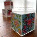
So this is my take on the sketch.
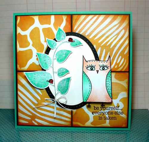
(this photo is uploaded from Flickr)

and this photo is uploaded from my Mac. I’m trying to decided if I should skip the extra step of uploading my photos from Flickr (a photo sharing web site) and if the extra clarity is worth it. Can you tell the difference?

TELL ME WHAT YOU PREFER AND I WILL DRAW A RANDOM WINNER TO WIN THIS

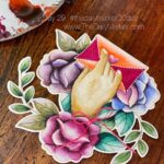
Now for the card details. This yummy paper is from a DigiKit from Betsy Tuma and you can purchase it HERE.
Here is one more card to see compare before you leave your comment. I will pick a winner next Tuesday.
This photo is from Flickr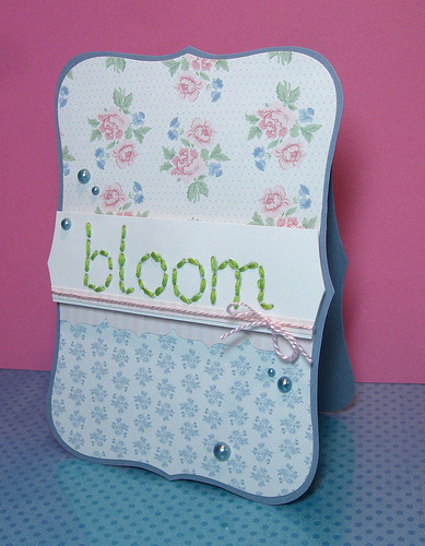
and this one if from my Mac…what do you think???

This DigiKit is from Betsy Tuma again available HERE and below is another card from the same DigiKit.

I am anxious to hear what you have to say. Have a great day! Hugs,Kathy
 BLOG CANDY to celebrate my BD
 Two Post Monday with SRM stickers & Squigglefly
 Shaker Card for STAMPtember

Well your cards are all amazing. It looks like you get a closer look at the ones from Flickr than your Mac. But they both are really clear.
hi Kathy
i think the cards uploaded with flicker are a bit clearer than just from the comp… i didnt even know there would be a difference… but i love all your cards they all look wonderful.. i have save the site you got your papers off till a little later… going out in a mins so dont have time to look….
kaz_za
I think that little owl with her eyelashes is such a cutie! The Flickr photo is much clearer on my screen.
Kathy, all of your cards are so wonderful! I love the colors in your second two! The sentiment on the first card is wonderful – right up my alley!
I can tell a little bit more clarity in the flicker photos, but if it’s a lot of trouble then I’d say the difference isn’t worth it.
I love all the patterns on that owl card. VERY cool 🙂
I have to look VERY close to see any real difference in the photos. Is your blogger photo uploaded in the extra large size?
The only difference for me is that I can see more detail because of the larger size of the flickr photo!
Hope that helps!!
Ok, first off…
What beautiful cards! (as always)
I really love that first one!
Love the colors.
And second, as for the photo clarity… I didn’t really notice a big difference with the first card. But in the second example, I did see that the Flickr photo was a bit more clear. The difference was not drastic though. I guess it just depends on your personal preference. Both pics look great though.
Fabulous cards, Kathy! When I look at the sentiment or the detailed patterned papers I can see a difference. The flickr ones look sharper/ clearer to me. 🙂 Hope that helps. Hugs.
I really like the one from Flickr… its not as bright on my monitor, it shows more of the color and more of the card. JMHO. The owl is too cute! 🙂 Flickr gets my vote for your cards, it just looks better and not so much white wash. 🙂
Love your cards… There is a bit of difference, but not a great deal to be honest!
Hugs
Kim
x
Absolutely GORGEOUS!!!!!! Love the stitching and details in the Blomm card!! The owl card is also fabulous. As for the photos, Flickr site does look a bit better ( I find that myslef), but not HUGE. So it’s up to ya!
Hi Kathy, I think they are both clear, although it seems the one from Flickr seem to be clearer and larger too! They did seem to take longer to upload when I clicked on the Flickr!
Love your cards Kathy, the one with the stitching is gorgeous, it’s so pretty and elegant. Love the flowers xxxx
Love all your cards today–I have a MAC–didn’t know there was another way to upload! Hm…I’ll be interested in seeing what everyone says. I like both uploads–if it is easier to upload with the MAC…I say that is the way to go though:)
These are so cute! I suffer from the same dilema.
I think I like the Flickr upload better, it seems sharper than your direct upload.
hi your cards are beautiful no matter what thats what i think and the photos from your mac are just as good you can still see all of the detail so if its quicker for you this way you should just use your mac its only slightly clearer on flickr hun xx
First I have to say your cards are always great…I have just came across flickr about a week ago and downloaded a bunch of pictures…I see it is well worth it. The photo is beautiful…not much difference. I prefer the flickr image…
smiles…Tammy
I really like the flikr the image is closer and you can really get your teeth into it..seeing things on screen can be flat so anything that makes it better more of a real feel is great..flikr all the way for me..ty for the chance..I wait and look forward to all your posts you are such an inspiration to me. Hugs Janet
Kathy, I really think it’s a toss up… I load everything directly from my PC without going through FLICKR. But I do post process in Photoshop! Hugs
I saved both images of the bloom card to my computer and opened them in graphic program. I think the fact that the one of your Mac might look less clear than the flickr one is because it is resized by blogspot. Once I downloaded them both I saw the blogspot one (once clicked) is 3 times the size than the Flickr one
and it’s a good quality image. So no need to upload them both to Flickr and blogspot also, unless you want a Flickr gallery of course. The one with the owl looks clearer in Flickr, but the Blogspot one is smaller and probably resized by blogspot, so hard to compare.
Beautiful cards by the way!
Wonderful cards Kathy- I like the flicker ones a wee bit better, just seems to be more intense color! Love the orange leopard and zebra stripe papers- fun!
You have almost succeeded in distracting me from your cards with all those questions!!! 😉 I think I like the first picks (flickr) better but for the first card it really is hard to say, it is so bright and cheery! Love them all!
Wonderful cards Kathy!!! I say Flickr hand down!!…almost missed the fine polka dots on the second Mac photo…you add so much amazing detail to your cards I would HATE for any of it to not be seen!!!!!!! Thanks for playing along with us at Card Patterns 🙂
im another who cant see any real difference… go with straight from the mac 🙂
Great cards Kathy. Not sure there’s enough difference to go to the extra bother.
Kat x
Really beautiful cards Kathy!
I say flick- photo looks is more sated, really.
Thanks…
These are adorable Kathy! Your cards are always so detailed. They must take you hours for each one! I like the size of the flickr photo but the clarity of the mac photo. You could always use GIMP to edit them- it’s free!
Love all your cards Kathy, love the eyelashes on that cute owl. I think that the flickr photos are fractionally better, but not much in it really.
The only difference I see is in size. But right now, if you click on your Mac photo- you can see it much larger. So for me, the Mac picture is fine. Love this card, btw. The colors are great together and that owl is so sweet w/ the lashes!
Beautiful cards Kathy, I think the mac quality is fine, flickr images appear marginally darker, that is the only difference I have noticed.
DARLING cards! Love the owl and the hand stitching on the 2nd and 3rd! Very nice! 🙂
Hi Kathy – don’t enter me in the draw, but I have to give my view. 🙂
I think the Flickr has the edge – slightly sharper for me, and the colours are slightly brighter. But there’s not a huge amount in it – and much of that could be due to the size. I love your large photos.
Hope you are well.
Lots of love xxxx
From any angle or source, your cards are always beautiful, dear Kathy. Your Mac upload seems fine. I usually just get problems when I resize what I upload directly to blogger. Resizing flickr or photobucket pics are okay. Go figure :-).
I’m no picture expert so I’ll just say I LOVE the ladybugs! So cute! xo Lisa
I do see a bit more detail in the Flickr photos (the dots on the owl for example) that look washed out in the Mac photo.
i can see more detail on your first pic! love all the cards!
wow! jaw droppers! gorgeous cards, Sista! I think the flickr ones look better and bigger. but either way, your cards are amazing! =) please don’t enter me to the drawing. have a wonderful day, my friend!
i think i accidentally left the last comment as anonymous… sorry! that’s me, sista! =)
LOVE LOVE your cards! Holy WILD card!! 😉
They both are clear to me!!
xo
I think they are both as clear. Do you use the picnic software? I never did but started to and than would blog through the flickr since it was way more clearer picture wise. But I can’t figure out how to do 2 or more pictures from flickr in one post! I think you can skip the step even though the picture is bigger. Life is busy why make it worse? Although if you use Hero you may still want to share it on the flickr group wall…. Both pictures look the same only flickr is bigger.
Hi, I like the one uploaded from your Mac. When you click on it, you get a bigger picture to look at. Cheers Sandie.
Hi Kathy!
I like the Flickr one best, it shows more of the stunning details you add to all your cards. And who would want to miss any off that?
Siri
Hey Kathy.
I have a mac too, and I edit my photo’s in i-photo before I upload them to flicker. I prefer it actually, since you have a lot of options. I am assuming the flicker ones are clearer, because you edited them with the picninc option?
However I don’t have a blog so I might be missing something in the way uploads are done to a blog. (I’m still learning.)
I love your cards Btw… They are gorgeous in both photo’s 🙂
Please don’t include me in the draw, I already have this gorgeous set, and I’d love to see it find a good home:)
love that second card. so pretty. And the mac photos look brighter, but it’s very subtle.
These are both just adorable!
I can’t really tell much difference between the two of them 🙂
Hi Kathy!
The Mac pictures look brighter. I love these cards! I have to confess that I went out and bought some markers and stamps because I was so inspired by your blog. I literally spent all Sunday going through your back posts just getting inspired.
I even tried my hand at sewing on cards, didn’t go so well but I’ll try again 🙂
Kathy.. I love your photos which uploaded from flickr rather than Mac.. On the first card i wonder how you make such like leather texture background behind the owl, that’s AWESOME!! and on your second card i ADORE your super neat stitches.. GORGEOUS artworks Kathy 🙂
Your cards really are works of art Kathy! I think the Flickr one seems just a bit brighter, but not much different. 🙂
Hey Kathy! Beautiful cards 🙂 I think the photos from Flickr have a bit more clarity than the Mac ones but its only a slight difference 🙂
Hi Kathy :), Personally the only difference I see between the two pictures is the flickr one is a bit closer (did that make any sense?). Love all the cards as well – Good luck with the challenge xoxoxoxoxo
hi kathy!
i like the flickr uploads better. a bit clearer than the other photo.
love the shabby chic-ness to your sewn card!
Hallo Kathy you are so generous…I wish I win this…it will be my belated sweet bday gift if I win (SMILE) your card is always so creative…I love your card Kathy…
Hi Kathy, what a stunning selection of cards! Its a very close call but I do think that the Flickr cards just have the edge for brightness and clarity. However, if you did want to upload direct from your PC I think it would be ok… as long as we still get to see your gorgeous cards!!! Jo x
All great cards Kathy! I prefer the Flick photos because the shots seem to be closer to the cards. Also the details like the ladybirds and pearls seem to be more distinct in the Flickr photos – I’m not sure if that’s just because it’s a closer shot.
The flickr ones are much clearer so I prefer them to see the details. 🙂
It seems that the ones uploaded through flickr are much sharper. Just wondering, what settings do you put your printer on when you print out digital? I’m having trouble getting the colors to match up between what I see on my monitor and what prints out 🙁
Love the owl card…gorgeous!!
I like the Flickr pics more…its easy to see the fabulous details of card on Flickr pics.
Hi Girlie…AWESOME Cards!!! I Like the Flicker image better for some reason….But then…who am I?? LOVE LOVE your cards!!
LOVE all of your cards! The stitching on the last one looks great with the two colors of thread! Very festive! I can’t see much difference in the photos.
Gorgeous set of cards, just love them all Kathy! I think the only reason why I do the bigger photo now, is you can see some more clarity in it and it has been saving me the extra step of having to take a close-up picture. That is all, other than that, it seems that both of your pics have good quality to them, that answer probably doesn’t help much … either way, I have been loving the ‘reduced’ step of the close-up photo. Hugs!
Hey Kath! First of all–love your cards! You put so much thought into all your sketches and such yummy details! They’re always such a treat!
Honestly, the Flickr uploads look darker to me. Can’t you just upload to your blog from iPhoto on your Mac? That way you can edit the photos first. Just a thought.
Love ya!!!!
Love the cute owl card, the background patterns are so cool too. I think the flickr photos are clearer but only by a miniscule amount. Love your bloom card too it is very ‘Cath Kidston’ looking with those pretty roses
Love the cards….I wasn’t aware that Flickr improved the image. Both images were fine but the Flickr image seemed somewhat larger which made them look clearer.
That first card with the animal print squares and that adorable owl is too much! Oh how I love the colors you used. I have that sentiment set and I so love it because of the size of the letters.
I think your cards would look great anywhere, but the flickr is a bit more crisp. Thanks for all the inspiration!
Hi, Kathy! All these cards are FAB! Love the wavy stitching you added on the Bday card. So lovely! And the “bloom” sentiment… Wow! For me, I’d say there is a very *slight* improvement in the photos from your Mac; slightly brighter, but I’d say it’s minimally better, so your Flickr photos would be just as sufficient. I’d say, whichever is easiest for you to upload!
Your cards are great. I couldn’t see a real difference in the photo’s. I would use the method that is easier for you.
xoxo Karen Lee
It seems that the 1st card was clearer from your Mac while the 2nd one seems clearer on Flickr. Sometimes, it’s great to have a gallery outside your computer.
Anyways, however you upload it, will look great because it’s yours. Same artwork just slightly different clarity.
Not a huge difference….only really notice that the Flickr pics seems larger which seems to bring out a bit more detail….like the little dots on the owls belly for example. Cheers Kathy!
Beautiful cards! I love your color combo for the owl card and your stitching for the word bloom is awesome!
The Flickr photo looks clearer to me. Hope this helps 🙂
Love the cards, I can’t tell the difference myself.
Such wonderful cards. Really love how you have used the animal prints.
Hello;
Uploades by Flickr allowes to see more clearly the details of your cards. I like it more.
La Vikinga